How do you generally arrive at a decision to improve your website?
Analytical tool can give information like traffic sources, page views, bounces, conversions and a lot more. But how often can these data points guide you to tangible improvements of your website on immediate basis?
Have you ever observed that the actual user behavior turned out to be different than your general assumption?
What do users do on your web pages? Where do they click on your pages? What content or page section is more popular on your website?
Heat map could answers these questions quickly.
Heatmaps can help a market place company to achieve revenue optimization by identifying appropriate banner placements on the website or could be helpful to media company in understanding what news or content draws higher attention. All this can be done very quickly, without looking at multiple analytics reports.
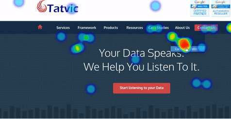
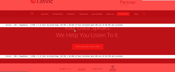
Heat Maps are visual, page-level presentations of every single action which a user performs on a given page of your website. The visualization is such that it really helps to take quick decisions on the website improvements and optimizing the web content. Infact, we suggest three different variants of such visual page level presentation to our clients, namely, A Heat Map, a Scroll Map, and a Click Map. These three maps do generate interesting actionable insights. Below listed are just an example of the kind of questions that a heat map can answer for you:
- What draws visitors’ attention?
- How far down on a page are visitors willing to scroll?
- How do visitors interact with a page’s elements?
So, what exactly are these maps that I am going on about? Let’s find out!
- Heat Map – Heat Map is a visual overlay aggregating click coordinates of all users to a specific page. It maps the user’s attention by marking the page with colored spots ranging from dark (cold; little attention) to bright (warm; much attention).

- Scroll Map – With a Scroll Map you can see exactly how far users are willing to scroll to find what they’re looking for. With a color gradient similar to the Heat Map’s, user attention is measured from lowest to highest (from dark to bright colors).

- Click Map – The Click Map is a quantification of the Heat Map. It is a visual overlay marking each interactive element with a pulsating circle. The color of the circle indicates the number of interactions, using the same color gradient as in the Heat and Scroll Maps, ranging from dark for cold to bright for warm.

Some of Tatvic’ clients have already integrated these maps on their websites and uncovered some surprising insights about how their users actually interact with their website.
Read this blog to know what these fascinating insights are from our clients who implemented these tools and discovered the benefits of Tatvic’s Heatmap Integration.