
With the proliferation of smartphones and the increasing shift towards mobile browsing and shopping, optimizing your mobile presence is no longer optional – it’s imperative.
In this article, we’ll explore cutting-edge Mobile Conversion Rate Optimization (CRO) strategies that are poised to make a significant impact in 2024. These strategies are not just about keeping up with the times; they’re about staying ahead of the curve, meeting the ever-changing needs of your mobile audience, and ultimately, boosting your conversion rates.
So, if you’re ready to unlock the full potential of your mobile platform and elevate your digital game in 2024, read on. We’ll dive deep into the latest trends, innovative techniques, and actionable insights that will help you harness the power of Mobile Conversion Rate Optimization for a successful year ahead. Let’s get started!
What is Mobile Conversion Rate Optimization?
Mobile Conversion Rate Optimization, commonly known as mobile CRO, is a dedicated strategy and set of practices aimed at improving the conversion rates of mobile users on a website or mobile app.
Given that mobile visitors often have distinct behaviours, preferences, and limitations compared to desktop users, mobile CRO focuses on tailoring the user experience for mobile devices. This involves optimizing mobile website or app design, content, layout, and functionality to ensure that visitors using smartphones or tablets are more likely to take desired actions, such as making purchases, signing up, or filling out forms.
While the fundamental principles of Conversion Rate Optimization (CRO) remain consistent, mobile CRO considers the unique characteristics of mobile users to maximize conversions and enhance the overall mobile user experience. This includes addressing issues like responsive design, page load speed, mobile-friendly navigation, and mobile-specific features to achieve higher conversion rates on mobile devices.
Benefits of Mobile Conversion Rate Optimization
Improved User Experience
Most people browse the internet on their phones and your website is no different. Improving user experience on your website number 1 builds trust and authenticity but also significantly influences positive brand perception. Also, if your users find navigating your website seamless and enjoyable, they are more likely to engage with your content, products, or services, ultimately leading to increased conversions.
Increased Revenue
As stated before, mobile accounts for over half of all e-commerce traffic. By optimizing your mobile website, you can increase the number of customers who convert into paying customers and thus generate more revenue.
Return on Investment with Digital Ads
Considering that 61.9% of Google Ads clicks come from mobile devices (Source), ensuring a mobile-friendly experience increases the likelihood of converting visitors from digital ads into customers.
Increased Visibility
Google and other search engines have taken a mobile-first approach to their indexing. This means that they will prioritize websites that are optimized for mobile devices over those that are not. By optimizing your website page speed, you can ensure improved visibility in search rankings and get more organic traffic.
Improved Customer Retention
Use analytics platforms like Google Analytics 4 to identify user origins. By optimising your mobile site accordingly, you enhance the user experience for your predominant mobile audience. This targeted approach boosts retention and drives higher conversions.
Mobile Conversion Optimization Rates Strategies
Now that you understand the importance of mobile CRO for your online business, here are some strategies to implement today
1. Mobile First Approach
The first step to optimizing your conversion rates on mobile is by adopting a mobile-first approach. This includes the following:
A. Mobile-specific research
Conducting focused mobile CRO research involves a thorough competitor analysis. Evaluate competitors’ checkout processes, including step count and pop-up strategies. Scrutinize the tone of website content. This comprehensive approach provides valuable insights for optimizing mobile conversion rates.
I normally use SimilarWeb for competitor research.
Also, as a side note, I would recommend that you start by reading research papers on the particular industry your client is in so that you can understand the industry better. I use Google Scholar to find relevant papers.
B. Analyse quantitative data
Quantitative data from Google or Adobe Analytics help you understand what visitors are doing on your website. You can use this data to identify areas where customers may be having difficulty navigating or completing their journey.
They help you with questions like Where and How much when it comes to customer behaviour.
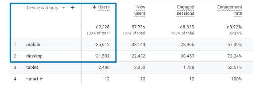
For example, in the above screenshot, we can see that mobile users more than desktop and tablet devices. This will give us insights into which device we should focus on for CRO.
C. Analyse qualitative data
Heatmaps and session recordings can provide valuable insights into user interactions on your mobile site. These tools allow you to see exactly how customers are navigating your site and which elements they’re paying attention to, as well as give you insight into what needs optimizing further.
They help you with questions like Why when it comes to customer behaviour.
Heatmaps can help you find design errors that affect conversions. Session recordings show you the customer journey and how it moves between pages.
2. Improve page speed
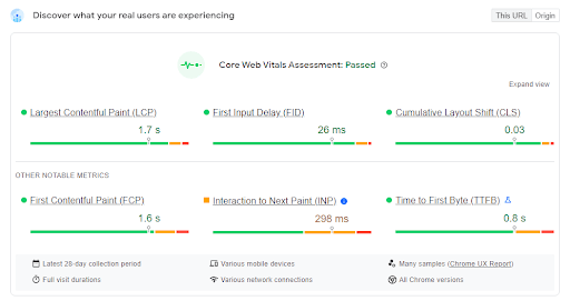
Page speed especially for mobile users is very important. Pages should load quickly, especially on slow networks. The benefits of fast-loading pages include improved user experience, higher search engine rankings and increased conversion rates.
Page Speed Insights and Web Page Test are great tools to get started on which elements are causing page speed issues on the website.
Here is how you can make sure your page loads quickly and improve your customer satisfaction:
A. Preload LCP image
Image size is the most significant factor for page loading speed so make sure your LCP (Largest Contentful Paint) image is preloaded to show up on your site faster.
B. Make images mobile-friendly
Optimize your images to be mobile-friendly like WebP or AVIF. Images that are too large can take longer to load and slow down your page, so make sure they’re compressed or in the right size and format.
C. Enable browser caching
Browser caching stores assets like HTML, CSS, JavaScript and images locally on the user’s computer so that they don’t have to download them every time. This significantly helps in reducing page loading time.
D. Minify code and CSS
Minification is removing unnecessary characters from a file such as whitespace, comments, line breaks etc. This can help reduce your file size and improve page speed.
Note: While I’ve highlighted common page speed issues, it’s essential to recognize that these issues might not be prevalent on your website. Begin with a thorough examination of your web page with the Page Speed Insights tool.
3. Optimize your user experience for conversions
A good user experience is essential for conversion rate optimization. By optimizing your mobile site for conversions, you can make sure that customers can easily find what they came for and complete their desired actions quickly and seamlessly.
Here are some tips on how to do this:
A. Providing key information above the fold
When customers land on your mobile site, they shouldn’t have to scroll or search for key information. Keep important content and calls to action above the fold so that customers can see them right away.
A good example of this would be adding categories on top of the homepage. Most websites hide their category pages within the hamburger menu. This is considered a bad practice as it can hinder discoverability and make it less convenient for users to navigate directly to the desired sections of the site.
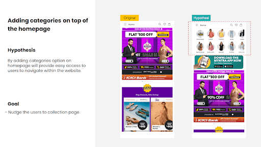
Note: This is just an example of Myntra. (Source)
B. Responsive design
Make sure your mobile site is designed to be responsive. This means that it should automatically adjust its layout and design when accessed from different device sizes and orientations.
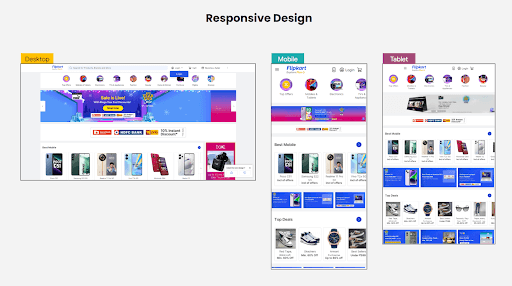
Note: This is just an example of Flipkart. (Source)
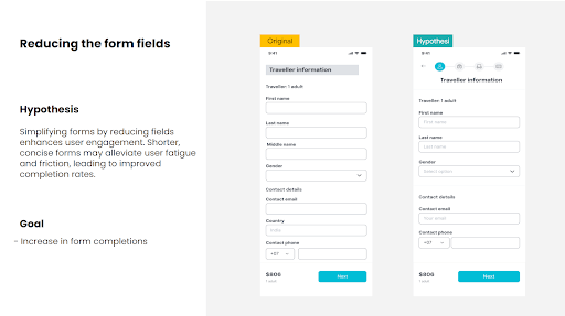
C. Reduce form fields
Reducing the number of form fields can help speed up the checkout process and reduce friction. Consider using progressive forms or auto-fill
D. Integrate digital wallets
Integrating digital wallets like Apple Pay, Google Pay and PayPal can help customers checkout faster on your site. This not only makes the process more convenient for them but also helps improve conversions on mobile.
Additionally, for clients dealing with high-ticket products, leveraging an EMI (Equated Monthly Installments) platform is advisable to provide flexible payment options, further optimizing the overall user experience and encouraging higher conversion rates.
E. Only have one call-to-action (CTA) per page
Too many CTAs can be confusing and distract customers from the main goal of your page. Stick to one CTA per page so that customers know what action they should take next. Your mobile site is an ongoing process, so make sure you monitor it regularly and adjust as needed.
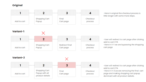
F. Shorten the purchase path
The purchase path should be as short and simple as possible. Make sure customers can complete their purchases quickly by reducing the number of steps required for checkout. For example, consider using single-click checkouts or enabling guest checkout to make it easier for customers to purchase from your mobile site.
G. Improve the readability of your content
Optimize content for mobile by ensuring legible font sizes, utilizing short paragraphs (around 150 words), and incorporating bullet points for readability. Enhance engagement with visual elements like images and videos to capture the reader’s attention.
J. Utilize white space
White space can help improve scannability and make content easier to read. When designing for mobile, use white space between blocks of text or images to draw attention to the most important elements on your page. Doing so will help customers focus on the key information quickly without feeling overwhelmed by too much content.
K. Shorten your headlines and page titles
Optimize content for mobile by ensuring legible font sizes, utilizing short paragraphs (around 150 words), and incorporating bullet points for readability. Enhance engagement with visual elements like images and videos to capture the reader’s attention.
4. Always A/B Test
A/B testing is an effective way to determine which design elements work best for your mobile site. Try different variations of page layouts, headlines, images, and more to see what works best for your customers. Collect data on the performance of each variation and use it to inform your future design decisions.
A/B testing can help you create a better experience for your customers on mobile and make sure that your site is optimized for success.
Final Thoughts
In mobile commerce, prioritizing Mobile CRO is not just a competitive edge but a necessity. Adopt a mobile-first approach, optimize page speed, refine user experience, and conduct continuous A/B testing to unlock the full potential of mobile conversions. Stay vigilant, adapt to evolving trends, and make data-driven decisions for sustained success in the dynamic mobile e-commerce landscape.
For personalized assistance, reach out to Tatvic today.