

In today’s mobile-first world, conquering the “thumb scroll” is no longer a luxury, it’s a necessity. With over 73% of web traffic originating from smartphones [source: Statista, mobile traffic share 2022], a seamless mobile user experience (UX) is the cornerstone of conversion rate optimization (CRO).
But how do you transform your mobile app or website from finger-fumbling frustration to a conversion machine?
The answer lies in strategic fundamentals of user experience design that cater to the unique needs of mobile users.
Here are Top-10 proven User Experience Fundamentals to Skyrocket Mobile UX and elevate your mobile conversion rates:
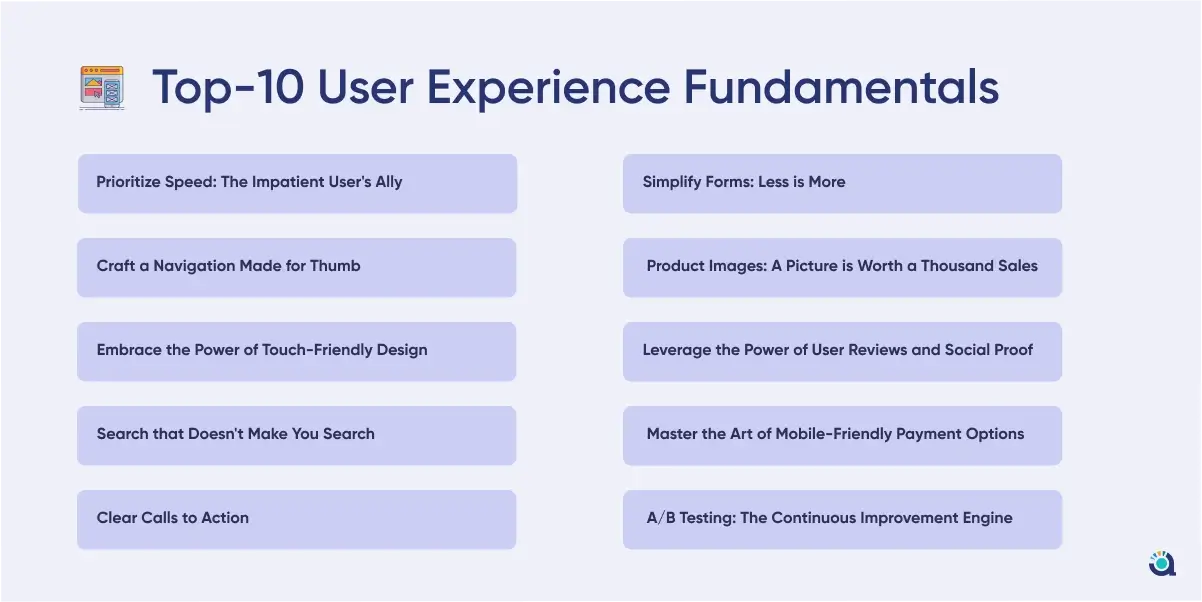
1. Prioritize Speed: The Impatient User’s Ally
One of the very basic UX fundamental design principles is speed. Imagine waiting for a webpage to load on your phone. Frustrating, right? A slow mobile experience is a conversion killer. Studies show that a one-second delay in mobile load time can decrease conversions by 7% [source: Kissmetrics, Impact of Website Loading Speed on Conversion Rate].
Here’s how to ensure a lightning-fast mobile experience by leveraging mobile conversion rate optimization services to speed up load times:
-
Image Optimization:
Compress large images without sacrificing quality. Tools like TinyPNG can significantly reduce file size.
-
Minify Code:
Eliminate unnecessary code elements like whitespace and comments to streamline page loading.
-
Mobile-Specific Caching:
Implement caching strategies to store frequently accessed content locally on user devices, minimizing server load times.
2. Craft a Navigation Made for Thumb
CRO experts also called this principle one of the top conversion rate optimization fundamentals.
Complex desktop navigation menus become cumbersome labyrinths on mobile screens. Here’s how to create a mobile-friendly navigation system with active assistance from mobile conversion rate optimization services:
-
The Hamburger Menu:
This ubiquitous icon is a familiar friend for mobile users. Ensure it’s easily accessible and displays essential categories.
-
Prioritize Key Functions:
Place frequently used functions like search bars, shopping carts, and account logins within easy thumb reach, typically at the bottom of the screen.
-
Limit Menu Levels:
Deeply nested menus lead to user frustration. Aim for a flat or two-level navigation structure for optimal usability.
3. Embrace the Power of Touch-Friendly Design
Buttons, links, and forms designed for desktop mouse clicks become clunky on touchscreens. Here’s how to make your mobile interface finger-friendly by leveraging mobile conversion rate optimization services:
-
Increase Button Size:
Ensure buttons are large enough for easy tapping, even with less-than-precise fingers. Aim for a minimum target area of 48dp x 48dp.
-
Ample Spacing:
Provide generous spacing between clickable elements to avoid accidental taps.
-
Prioritize Functionality Over Aesthetics:
While maintaining a visually appealing design, prioritize functionality. Large, clear buttons are more important than intricate details.
4. Search that Doesn’t Make You Search (for the Search Bar)
A well-designed search bar is a mobile user’s lifeline. Here’s how to make yours shine with conversion rate optimization services:
-
Prominent Placement:
Place the search bar in a readily accessible location, ideally at the top of the screen.
-
Auto-complete and Suggestions:
Utilize auto-complete features and suggest relevant searches as users type to expedite navigation.
-
Voice Search Integration:
Consider incorporating voice search functionality for a truly hands-free experience.
5. Clear Calls to Action
Your call to action (CTA) is the final nudge that converts a browsing user into a paying customer. Here’s how to craft compelling CTAs for mobile with the most efficient mobile conversion rate optimization services:
-
Strong Verbs, Clear Benefits:
Use action-oriented verbs like “Buy Now” or “Sign Up” and couple them with clear benefits to incentivize user action.
-
Eye-Catching Design:
Make your CTAs stand out with contrasting colours and clear text. Consider using a larger font size for optimal readability.
-
Strategic Placement:
Position CTAs strategically at the end of product descriptions, near shopping cart icons, or after informative content.
6. Simplify Forms: Less is More
Lengthy forms are a conversion roadblock. Here’s how to streamline your mobile form with conversion rate optimization services:
-
Collect Only Essential Information:
Only request information essential for the user’s action. Consider offering guest checkout options for faster purchases.
-
Auto-fill Magic:
Utilize auto-fill features to pre-populate fields with user data stored on their device.
-
Mobile Keyboard Optimization:
Ensure forms are optimized for mobile keyboards, including larger input fields and clear labelling.
7. Product Images: A Picture is Worth a Thousand Sales
High-quality product images are crucial for mobile conversions. Here’s how to optimize your mobile product imagery with efficient conversion optimization services:
-
Fast Loading Images:
As discussed earlier, prioritize image optimization to ensure quick loading times.
-
Multiple Angles and Zoom Functionality:
Showcase products from various angles and allow users to zoom in for detailed inspection.
-
High-Resolution on All Devices:
Ensure high-resolution images adapt seamlessly to different screen sizes.
8. Leverage the Power of User Reviews and Social Proof
Social proof is a powerful tool for building trust and influencing purchase decisions. Here’s how to leverage it on mobile:
-
Customer Reviews and Ratings:
Display prominent customer reviews and ratings to add credibility and social proof.
-
Social Media Integration:
Integrate social media buttons to allow users to easily share their experiences or favourite products.
-
User-Generated Content:
Encourage user-generated content by featuring customer photos or reviews on your mobile platform.
9. Master the Art of Mobile-Friendly Payment Options
A seamless checkout process is essential for mobile conversions. Here’s how to optimize your mobile payment options:
-
Multiple Payment Gateways:
Offer a variety of popular payment methods like credit cards, digital wallets (e.g., Apple Pay, Google Pay), and buy-now-pay-later options.
-
Guest Checkout:
Allow guest checkout options for faster transactions, especially for first-time buyers.
-
Secure Payment Environment:
Ensure a secure payment environment with clear security badges and encryption protocols.
10. A/B Testing: The Continuous Improvement Engine
The mobile UX landscape is constantly evolving. Here’s how to stay ahead of the curve by adopting the following mobile conversion rate optimization services:
-
A/B Testing:
Implement A/B testing strategies to compare different design elements, layouts, and CTAs. This data-driven approach helps you identify what resonates best with your mobile audience.
-
Heatmaps and User Session Recordings:
Utilize heatmaps and user session recordings to gain valuable insights into user behaviour on your mobile platform. Analyze where users tap, scroll, and drop off to identify areas for improvement.
-
User Feedback:
Actively solicit user feedback through surveys or in-app prompts. This direct feedback loop provides invaluable insights into user needs and preferences.
Conclusion: The Mobile-First Mindset
By prioritizing these 10 mobile user experience design fundamentals, you can create a user-friendly and conversion-focused mobile experience. Remember, a seamless mobile journey is no longer a competitive edge, it’s the table stakes in today’s mobile-first world. Embrace the power of mobile UX optimisation and watch your conversion rates soar!