In 2026, data is no longer scarce. Attention, clarity, and trust are.
Almost every organization today has access to dashboards built on GA4, BigQuery, Looker, Power BI, Tableau, or custom BI stacks. Yet, despite having “accurate data,” most dashboards still fail at the one thing they are meant to do:
Help humans make better decisions, faster.
- Executives don’t want more charts.
- Marketing leaders don’t want more filters.
- Product teams don’t want more tables.
They want clarity at a glance.
This is where dashboard design stops being a technical exercise and becomes a cognitive and behavioral discipline.
In this guide, we break down the 6 timeless design laws rooted in human psychology and UX science that will help you create dashboards that are not just visually appealing, but usable, trusted, and action-driven.
TL;DR:
Mastering dashboard creation in 2026 is less about visual flair and more about designing for human behavior. Effective dashboards follow six proven design laws—Fitts’s Law (make key KPIs easy to find and interact with), Jakob’s Law (use familiar layouts users already understand), the Law of Prägnanz (simplify visuals to reduce cognitive load), Gestalt Laws (group related metrics to reveal patterns instantly), Miller’s Law (limit information per view to avoid overload), and Hick’s Law (reduce choices to speed up decision-making). When applied together, these principles transform dashboards from data-heavy screens into intuitive decision-making tools that drive clarity, adoption, and real business impact.
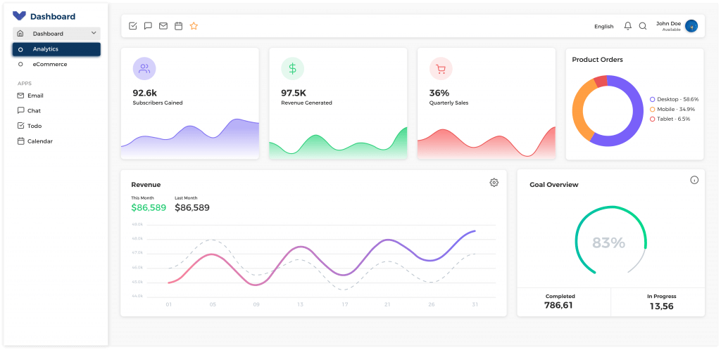
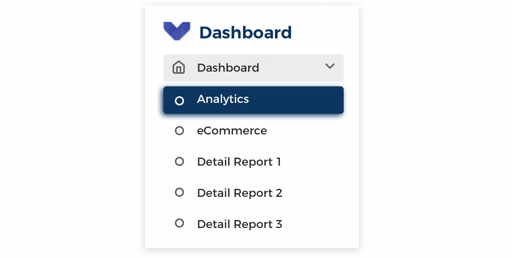
What Is a Dashboard? (And What It Is Not)
A dashboard is an interactive, decision-oriented interface that surfaces the most critical business signals at a glance, helping stakeholders understand performance, detect anomalies, and take action—fast.
In 2026, dashboards are no longer passive reporting layers. They are active decision environments, designed to answer one core question:
“What should I do next?”
A well-designed dashboard reduces cognitive load, accelerates insight, and aligns teams around the same version of truth without requiring deep data expertise.
What a Dashboard Is?
A modern dashboard is:
–> A Decision-Support System
Dashboards exist to enable decisions, not just display data. Every metric, chart, and visual hierarchy should directly support an action, choice, or strategic direction.
–> A Curated Summary of What Matters Most
Dashboards prioritize signal over noise. They focus only on the metrics that materially impact outcomes—revenue, growth, efficiency, risk, or customer experience.
–> A Starting Point for Investigation
A dashboard is not the final destination. It is the first lens that highlights where deeper analysis is required—guiding users toward root-cause exploration, not replacing it.
What a Dashboard Is Not?
Despite how they’re often used, dashboards are not:
–> A Data Warehouse
Dashboards should never attempt to store or expose raw, unfiltered datasets. That’s the job of data warehouses, lakes, or analytics backends.
–> A Spreadsheet Replacement
Dashboards are not meant for row-by-row inspection or manual manipulation. They are designed for pattern recognition, comparison, and trend analysis.
–> A Dumping Ground for Every Available Metric
More metrics ≠ more insight. Overloaded dashboards dilute attention, increase misinterpretation, and slow decision-making.
The Reality of Dashboards in 2026
In 2026, dashboards sit at the intersection of four critical forces:
1. Business Strategy
Dashboards increasingly reflect OKRs, North Star metrics, and board-level KPIs, not just operational numbers.
2. Human Attention
With shrinking attention spans and decision fatigue, dashboards must respect how humans scan, prioritize, and process information.
3. Data Engineering
Modern dashboards pull from dozens of sources—web analytics, apps, CRM, ad platforms, CDPs, experimentation tools, and AI models—requiring strong data foundations.
4. UX & Cognitive Psychology
Design choices now directly influence interpretation, bias, trust, and action. Poor design doesn’t just confuse—it misleads.
This convergence makes dashboard design a strategic discipline, not a visual afterthought.
Why Dashboard Design Laws Matter More Than Ever in 2026
Modern dashboards face challenges that didn’t exist even a few years ago:
-
Explosion of data sources across marketing, product, sales, and customer platforms
-
AI-generated insights that still require human judgment and context
-
Senior stakeholders with limited time, scanning dashboards in seconds—not minutes
-
Remote-first decision-making, where dashboards often replace meetings, presentations, and status calls
As a result, dashboards today carry more responsibility than ever before.
Without strong design principles, dashboards quickly become:
-
Overwhelming
-
Misleading
-
Distrusted
-
Completely ignored
And a dashboard that is ignored is worse than no dashboard at all.
The Need for Dashboard Design Laws
Effective dashboards are not designed for data engineers, analysts, or tools.
They are designed for how humans actually see, think, and decide.
That’s why modern dashboarding requires clear design laws—principles rooted in:
-
Cognitive load theory
-
Visual perception
-
Behavioral decision science
-
Real-world business usage
The following six dashboard design laws are built for 2026 realities: AI-assisted analytics, executive consumption, and outcome-driven decision-making.
They don’t just make dashboards look better. They make dashboards work.
The 6 Laws of Effective Dashboard Design (2026 Edition)
Modern dashboards fail not because of data quality but because they ignore how humans think, see, and decide.
The most effective dashboards in 2026 are not built around tools, charts, or data schemas, they are built around cognitive psychology, UX research, and behavioral science.
These six dashboard design laws are tool-agnostic and apply equally to:
- GA4 dashboards
- Executive scorecards
- CRO & experimentation dashboards
- Product & growth analytics views
- AI-assisted decision dashboards
They are timeless in principle but more critical than ever in a world of AI insights, remote decision-making, and shrinking executive attention spans.
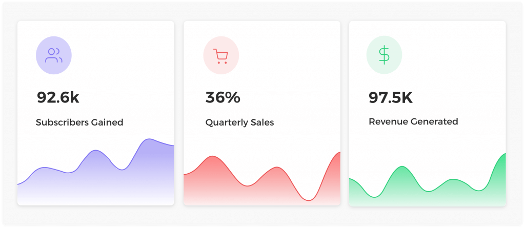
Law #1: Fitts’s Law: Make Key Insights Impossible to Miss
“The time to acquire a target is a function of the distance to and size of the target”
What This Means for Dashboards
The closer and larger an element is, the faster users can notice and interact with it.
In dashboards, this translates to one non-negotiable rule:
Your most important KPIs should require zero effort to find.
If stakeholders have to search for answers, the dashboard has already failed.
Dashboard Best Practices in 2026
Design your dashboard so that primary KPIs are:
Placed strategically
- At the top of the dashboard
- In the natural visual entry point (top-left or visual center)
Designed for instant recognition
- Large enough to dominate visual hierarchy
- Clearly labeled (no abbreviations or internal jargon)
- Interpretable without tooltips or explanations
Aligned with human scanning behavior
- Optimized for F-pattern and Z-pattern reading
- Left-to-right, top-to-bottom logic
Common Mistake to Avoid
Burying business-critical metrics:
- Below filters
- Inside tables
- After secondary charts
If a CEO has to scroll, filter, or hover just to understand performance, the dashboard is not executive-ready.
Law #2: Jakob’s Law: Don’t Make Users Learn Your Dashboard
“Users spend their time on other interfaces. This means that users prefer your interface to work the same way as all other interfaces they already know”
What This Means for Dashboards
Users bring mental models from:
- Other BI tools
- Spreadsheets
- Past dashboards
- Familiar SaaS products
While innovation is tempting, familiarity builds trust.
Dashboards should feel instantly usable even to first-time viewers.
Best Practices for Familiarity
Use conventional visualization patterns
- Line charts → trends over time
- Bar charts → comparisons
- Tables → detailed breakdowns
Standardize interaction patterns
- Filters in predictable locations
- Consistent date selectors
- Reusable layouts across dashboards
Maintain universal color semantics
- Green = positive
- Red = negative
- Yellow = caution
Why This Matters in 2026
When users don’t have to learn the interface, they can focus on:
- Understanding insights
- Asking better questions
- Making faster decisions
A dashboard that feels “obvious” is a dashboard that gets used.
Law #3: Law of Prägnanz: Simplicity Wins Every Time
“People will perceive and interpret ambiguous or complex images as the simplest form possible, because it is the interpretation that requires the least cognitive effort of us”
What This Means for Dashboards
No matter how complex your data is, users will mentally simplify it.
Your role is not to fight simplification but to control it intentionally.
Best Practices for Cognitive Clarity
Remove visual noise
- Excess colors
- Decorative elements
- Heavy gridlines
- Redundant labels
Strengthen meaning
- Clear, action-oriented chart titles
- Annotations explaining spikes or drops
- Consistent scales and formats
Design for instant comprehension
- One idea per chart
- One message per visual
Core Insight
If a chart needs a paragraph to explain it, it doesn’t belong on a dashboard.
Dashboards should explain themselves in under 5 seconds.
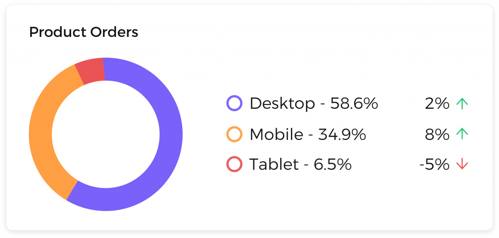
Law #4: Gestalt Laws of Grouping: Control How Data Is Interpreted
“Humans naturally perceive objects as organised patterns and objects”
The 4 Most Important Gestalt Principles for Dashboards
1. Proximity
Elements placed close together are perceived as related.
2. Similarity
Items with similar colors, shapes, or sizes are grouped mentally.
3. Common Region
Items inside the same visual container feel connected.
4. Focal Point
Visual emphasis directs attention to what matters most.
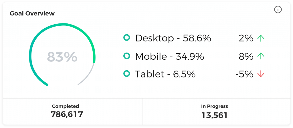
How to Apply This in Dashboards
- Group related metrics (e.g., traffic + engagement)
- Clearly separate unrelated sections
- Use spacing intentionally—not randomly
- Create visual “zones” for different business questions
Result
- Faster comprehension
- Lower misinterpretation risk
- Stronger narrative flow
- Better decision confidence
Great dashboards don’t just show data, they tell structured stories.
Law #5: Miller’s Law: Respect Human Memory Limits
The average person can only keep 7 (plus or minus 2) items in their working memory”
What This Means for Dashboards
Trying to show everything on one screen doesn’t increase clarity, it destroys it.
Best Practices for Information Density
Design each dashboard view around:
- One core question
- One primary audience
Break complexity into:
- Tabs
- Pages
- Thematic sections (Acquisition, Engagement, Revenue, Retention)
A Common Myth to Ignore
“Users don’t like scrolling.”
Reality:
Users dislike confusion, not scrolling. They will happily scroll through a well-structured narrative.
Law #6: Hick’s Law: Fewer Choices, Faster Decisions
“The time it takes to make a decision increases with the number and complexity of choices”
What This Means for Dashboards
- More metrics slow decisions.
- More filters create hesitation.
- More options increase ambiguity.
Dashboards should guide conclusions, not overwhelm users.
Best Practices for Decision Velocity
Prioritize answering:
- What changed?
- Why does it matter?
- What action is required?
Use progressive disclosure:
- High-level summary first
- Drill-downs only when necessary
Be ruthless about removing:
- Vanity metrics
- “Nice-to-have” charts
- Metrics without a decision attached
The Core Principle
A great dashboard doesn’t answer every possible question.
It answers the right question—quickly, clearly, and confidently.
Common Dashboard Mistakes to Avoid in 2026
Even highly data-mature organizations still get dashboards wrong.
Not because their data is inaccurate—but because their dashboards are designed as reports, not decision tools.
As dashboards replace meetings, presentations, and manual reviews, design mistakes now have a direct impact on speed, confidence, and quality of decisions.
Here are the most common dashboard mistakes organizations continue to make in 2026 and why they silently kill adoption:
1. Treating Dashboards Like Static Reports
Many dashboards are still designed as:
- Monthly PDFs in disguise
- Screenshots of spreadsheets
- One-way reporting surfaces
Why This Fails
Dashboards are meant to support ongoing decision-making, not retrospective reporting.
Static layouts:
- Hide trends
- Delay action
- Encourage passive consumption
What to Do Instead
Design dashboards as living decision systems:
- Emphasize trends over point-in-time numbers
- Highlight changes, deltas, and anomalies
- Design for weekly or daily use—not monthly reviews
2. Designing for Analysts Instead of Decision-Makers
A subtle but costly mistake.
Many dashboards are optimized for:
- Analysts who built the data
- Power users who know every metric
- Internal teams who already understand context
Why This Fails
Executives and business leaders:
- Scan, not analyze
- Decide in seconds, not minutes
- Need conclusions—not raw data
What to Do Instead
Design for the least technical but most influential user:
- Use plain language
- Avoid internal acronyms
- Prioritize interpretation over precision
A dashboard that only analysts understand is not a business dashboard.
3. Overusing Filters and Interactivity
Interactivity is powerful but dangerous when overused.
Common symptoms:
- Too many dropdowns
- Nested filters
- Mandatory filtering before insights appear
Why This Fails
Every filter is a decision tax.
More choices:
- Slow users down
- Increase cognitive load
- Create analysis paralysis
What to Do Instead
Use opinionated defaults:
- Pre-filtered views for key audiences
- One clear “source of truth” view
- Progressive disclosure for advanced users
The best dashboards answer key questions before users touch a filter.
4. Measuring Everything Instead of What Matters
Modern data stacks make it easy to track hundreds of metrics.
That doesn’t mean you should show them.
Why This Fails
More metrics:
- Dilute attention
- Reduce clarity
- Increase misinterpretation
Stakeholders walk away knowing more numbers but less meaning.
What to Do Instead
Every metric should answer one question:
“What decision does this metric support?”
If a metric doesn’t influence action, it doesn’t belong on the dashboard.
5. Optimizing for Data Completeness Instead of Clarity
Many teams aim for dashboards that are:
- Technically exhaustive
- Perfectly reconciled
- Universally correct
Why This Fails
Decision-makers value clarity over completeness.
A slightly incomplete but clear dashboard:
- Drives action
- Builds trust
- Gets used
A perfectly complete but confusing dashboard:
- Gets ignored
What to Do Instead
Design for directional truth:
- Clear trends
- Clear signals
- Clear next steps
Dashboards exist to reduce uncertainty not eliminate it.
The Real Reason Dashboards Fail
Dashboards don’t fail because data is wrong.
They fail because design ignores human behavior.
When dashboards fight attention, memory, and decision psychology, no amount of data accuracy can save them.
Applying the 6 Laws Across Real-World Dashboards
The six dashboard design laws become truly powerful when applied to specific business contexts.
Here’s how they translate across common dashboard types in 2026.
1. Executive Dashboards
Executive dashboards are decision accelerators, not monitoring tools.
Design Principles
- Focus on outcomes, not activities
- Limit KPIs to strategic goals
- Highlight exceptions, risks, and anomalies
What Great Executive Dashboards Do
- Show what’s off-track instantly
- Reduce meeting dependency
- Align leadership on one version of truth
If everything looks “fine,” the dashboard isn’t doing its job.
2. Marketing & Growth Dashboards
Marketing dashboards must connect effort to business impact.
Design Principles
- Tie metrics directly to revenue, pipeline, or retention
- Show trends and momentum, not isolated numbers
- Separate performance views from diagnostic views
Why This Matters
Growth teams move fast.
Dashboards should help answer:
- What’s scaling?
- What’s declining?
- Where should we double down—or pull back?
3. Product & CRO Dashboards
Product and CRO dashboards exist to validate hypotheses quickly.
Design Principles
- Group metrics by user journey stage
- Prioritize behavioral signals over vanity metrics
- Enable rapid comparison across variants or cohorts
What High-Performing Teams Do
- Use dashboards to kill weak ideas fast
- Focus on leading indicators
- Design for learning—not reporting
Tools Don’t Fix Bad Design, Good Design Scales with Tool.
What Great Dashboards Actually Require
Regardless of the tool, great dashboards depend on:
- Clean, well-structured event and business data
- Clearly defined business questions
- Strong design principles grounded in psychology
- Editorial judgment over blind automation
AI can surface insights. Automation can speed up reporting. But only humans can design clarity.
Conclusion: Great Dashboards Create Better Decisions
Dashboards are not about charts or visuals.
They are about:
- Trust
- Focus
- Confidence
- Action
By applying the six laws of effective dashboard design:
- Fitts’s Law
- Jakob’s Law
- Law of Prägnanz
- Gestalt Grouping
- Miller’s Law
- Hick’s Law
You move closer to building dashboards that:
- Get used consistently
- Get trusted instinctively
- Actually influence decisions
In 2026, the best dashboards are not the most detailed ones. They are the ones that respect how humans think.