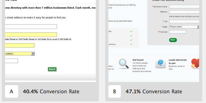
A website always has different problems to solve. E.g. higher bounce rate, lower conversion rate, users dropping out during shopping and checkout process etc. One would carry out A/B tests to solve these problems on juicy sections (Checkout, home page, product page etc.) of the site, which would directly or indirectly impact conversion rates. This blog post gets in to details of how to find hypothesis for A/B test experiments on these juicy sections, which would impact the most on conversion rates.

Before you get to generate hypothesis, it’s important know all the problem areas, to make sure that you are not leaving the most important loophole before you start testing.
Gather Insights
This can be derived from analytics and shopping trends observed by you or your marketing person. These insights should be in brief and should highlight problem areas. E.g., “The drop out rate on product details page is way too high”, “90% people are exiting from checkout page, this should be improved” etc.
Run usability Audit
You can even find problems and loopholes by running a usability audit on your website.There are some problems, which you can’t derive from analytics numbers. E.g., “The call-to-action merges with the background and isn’t easily locatable”. You can find out these usability issues by surfing the website like a layman and identify problems on home page, product page, check out process etc. You can even hire usability specialists to do an audit of your website.
Ideally, these are main areas you should run your usability audit on,
- Home page
- Product category page
- Product details page
- Shopping cart page
- Checkout process
- Other sections/elements which apply to entire website
6 DIY Hypothesis for A/B Tests
After this audit, you have problems ready. Suggestions for these become hypothesis.Generate hypothesis for all main sections mentioned above plus sections you think are important part of the shopping process and can impact highly on conversions.
Keeping above sections in mind, here are some common hypotheses from the A/B tests we’ve run for our clients.These apply to almost all sites, especially e-commerce.
- Home page
- The main communication/banner that explains products/services in brief increases curiosity in users’ mind and increases time spent
- A prominent call-to-action in first fold increases chances of getting clicked
- What’s in it for me factor wins user’s mind to browse the site further
- A prominent “About us” link builds trust in user’s mind
- Product category page
- Filters save people’s time. They can quickly find what they are looking for
- Showcase of main products from top categories is a good start point towards the sale
- A “know more” button/link for each product increases curiosity in user’s mind to know more
- Product details page
- Product recommendations give a personalized experience plus help in increasing order value
- If “Add to cart button” is the most attractive element on the page, it hits in the eye and increases chances of getting clicked
- “Add and checkout” button saves customer’s time. Mostly people buy 1 product per transaction
- Social sharing buttons are good to make the product page viral
- Shopping cart page
- Trust builders like “verified by visa” in first fold increase trust
- “Proceed to checkout” as a prominent button/link entice customers to click now
- Checkout process
- One page checkout decreases dropout and time wasted between loading of two pages
- Guest checkout is something that a new customers always prefer. They are not comfortable giving their personal info to a website, especially for the first time
- If steps of checkout are visible throughout the entire checkout process, the customer will know what ‘s going to happen next. It increases chances of completion of the process
- Other sections/elements which apply to entire website
- Easy navigation and simple to understand links in main menu earn user’s trust and attract her to know more about the product/service by clicking them.
- If Social buttons (facebook, twitter, rss etc.) are kept at same position on all pages, they increase chances to be located. Normally, these buttons are kept in the footer.
From above, you might be having some elements already on your website. These hypotheses can be applied to almost all e-commerce sites. But apart from that, there are some important hypotheses that you can only generate after a Usability audit. E.g., from audit, you might fin d out that you are not promoting that on home page. It’s a good feature to push for sale.
Generate A/B test ideas from hypothesis
After these hypotheses are generated, they should be transformed in to A/B test ideas.
e.g., in point 5 above for Checkout process, if you want to test hypothesis no. 3, the idea for A/B test should be: testing the current checkout page vs the new one with steps highlighted.
After you are done testing big things, go for tweaks. Test button colors, menu names etc. But keep testing. It’s a good way to increase conversion rates with low efforts.
Prioritize
From these ideas, plan A/B tests for low hanging fruits first. First go for things, which are low effort (less design changes) and high impact. E.g. testing checkout process will directly impact revenue. Many think that the checkout should be the first section to improve. But, there are a lot of websites, which struggle to get people to make a purchase or hold them through entire shopping process.
This is an ideal list of priorities that can be followed to schedule A/B tests towards increasing conversions:
- Get users to start the shopping process asap
- This may include improving the product page, category page and home page.
- Improve checkout process
- It’s good to spend energies on tweaking the checkout process with more people entering.
- Navigation
- Take up the navigation now. Have fewer people getting lost.
- Value proposition
- This should include improving home page. This can even be on first priority if the home page has a very high bounce rate. Try product videos, testimonial, features, more clear communication etc. (if not having already)
After improving conversion rates by applying all crucial and once-in-a-while tests, it’s now good to go for small tweaks. Test current call-to-action vs a new one, test tagline, button colors etc.
P.S.: If you want to get your website’s usability audit done or have any queries about conversion rate optimization, you can contact us here.


