It’s been a long time since we’ve seen the new look of Google Analytics, called “version 5″. There’ve been a lot of changes since it was introduced in Feb 2011.
While working with many different clients, there are some features we liked a lot.
Let’s see these important changes, which eased the way we look at our data in Google Analytics.
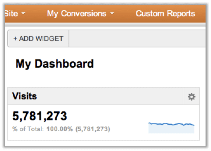
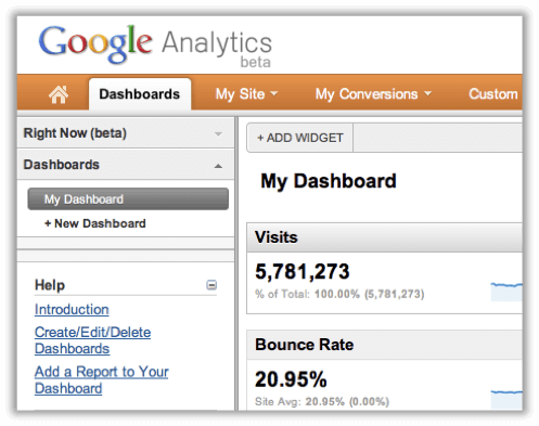
“Dashboard” is now “Dashboards”

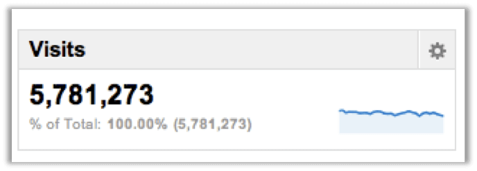
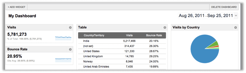
In the new version, we can see “Dashboards” as a tab. We can now have more than one Dashboard in Google Analytics. You’re now allowed to create 20 such dashboards with a maximum of 12 widgets per dashboard. You can easily add/edit/delete widgets.
Widgets
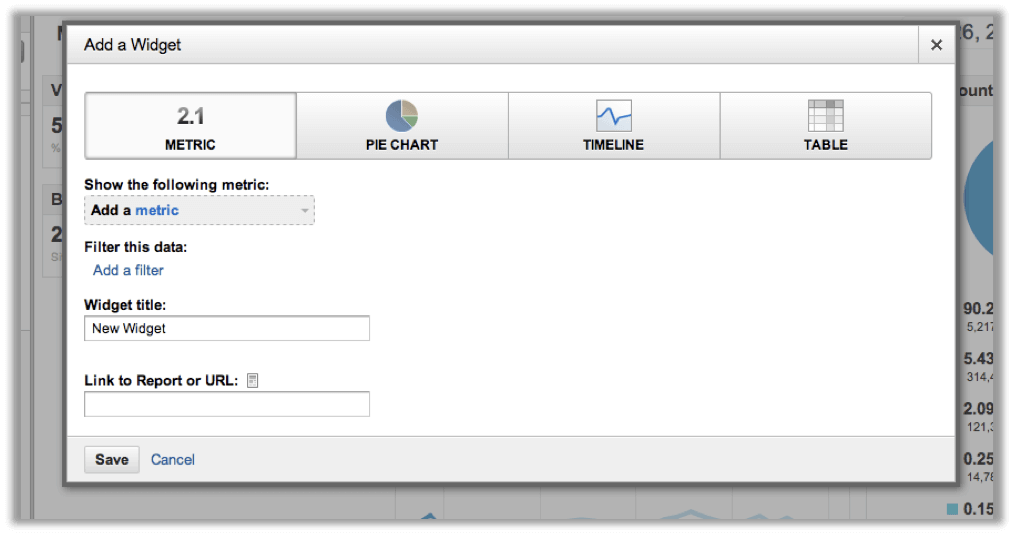
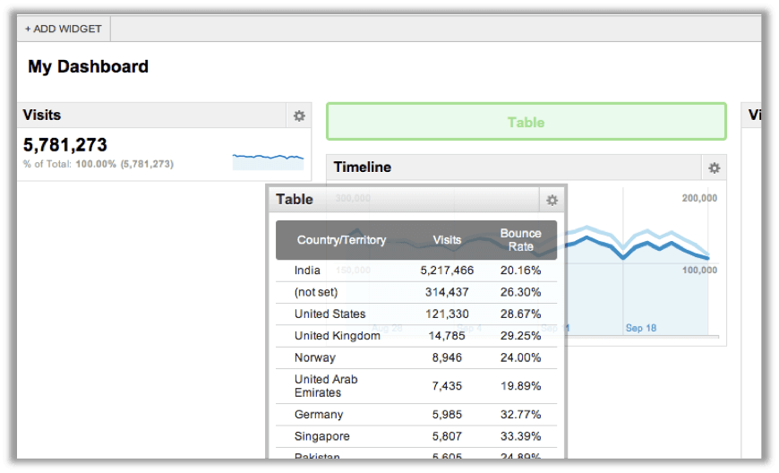
You can now have 12 widgets per dashboard. Plus, it’s easy now. Previously, to add any widget to your dashboard, you had to go to a particular report, let’s say “Traffic Sources”. You first go to the Traffic sources report and then click on a small “Add to Dashboard” button and it added that widget to your dashboard. Now, just click on “Add widget” in the header of your dashboards, and it provides an easy way to create your fully customizable widget. You can create 4 types of widgets now. Metric, Pie chart, Timeline, and Table.
New fresh look
The ease of use has increased in v5. Here are things we liked a lot,
- With the new fresh look, the Google team adds a lot of usability to it. Especially, the new dashboard is much more user-friendly than the older one.
- Add any widget from any of your dashboards.
- It’s now more flexible. You can drag and drop your widgets anywhere you want. You can now choose how your dashboard should look.
- Click on the Settings button on any widget to edit/delete it. Very swift!
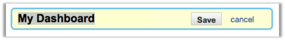
- You can rename your dashboard with a click.
- The “timeline” which was a default in the dashboard, is not compulsory. The new dashboard is cool! You can customize it the way your want. E.g., create a dashboard with only “Pie charts” of your marketing campaigns or a dashboard with only timelines of your different traffic sources. No mandatory sections, all yours!
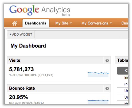
- The right sidebar is sometimes annoying and takes up unnecessary space. Now you can remove it with one click. Your dashboard is spread on the entire screen, reducing destruction.
Overall, The new Dashboard in Google Analytics 5 is now more smooth, good-looking, and easy to use.
Check out these sample Dashboards we’ve created for Email marketing and PPC campaigns.
Google Analytics Dashboard – Email Marketing
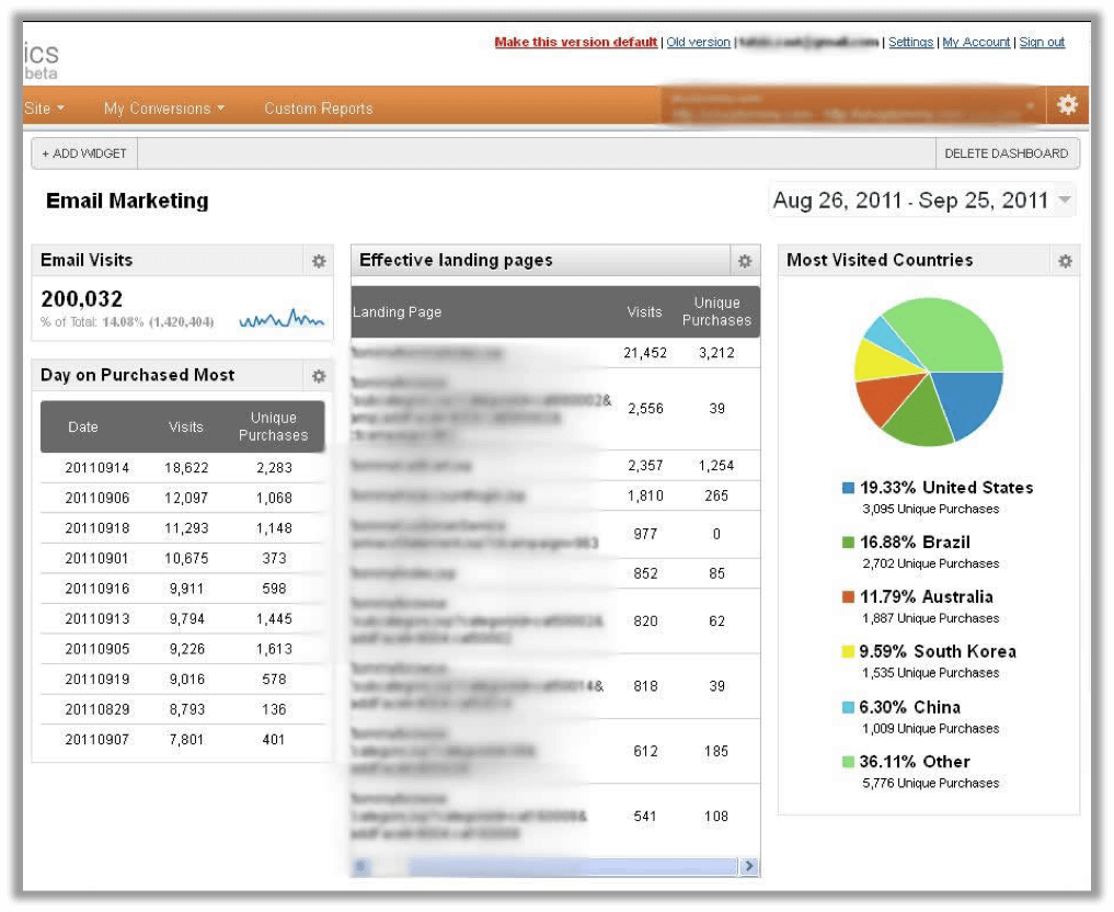
This dashboard shows the performance of the Email campaigns. We’ve added these customized widgets in this dashboard:
Email Visits Shows a number of visits came from mailer campaigns.
Effective landing pages indicate the performance of the landing page with respect to clicks and unique purchases; it’s helpful in deciding which landing page is more effective in mailer campaigns.
Most Visited Countries shows the most visited countries by unique purchases. It’s useful to understand in which geographic location you’re campaign is more successful.
Day on Purchased shows the information on which date users purchased the most, out of people visited by mailers. It helps in analyzing which days are generating more/fewer revenues.
PPC Dashboard
We’ve created this google analytics dashboard for the pay-per-click campaign.
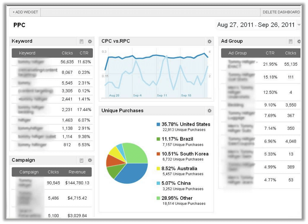
We’ve added the below Performance indicators (widgets) in the PPC dashboard to measure the effectiveness of the PPC campaign.
Unique purchases by a country shows in which geographic location the campaign is generating the highest revenues. As you can see in the above screenshot, people in the US do most of the purchases. These are the people who click on a PPC ad and buy.
Ad groups with CTR & Clicks indicate the performance of ad groups in terms of how many clicks and CTRs are generated by ad those groups.
Campaign with the clicks & revenue gives the performance of the campaign in terms of clicks and revenue.
CPC vs. RPC is a timeline showing a comparison between cost per click and revenue per click.
Benefits of creating customized Dashboards
1 ) Google Analytics Dashboards are very useful and handy for marketers, let’s say you’ve created 4 to 5 different kinds of dashboards to measure the performance of marketing campaigns. It will help you to get an idea about the performance of your marketing campaigns without looking much into detailed data.
2) Google Analytics Dashboards now have a more powerful graphical representation that can be easily understood by the top management team or by any non-technical person.
With this, we’d love to know from you how you are taking advantage of this cool and completely customizable dashboard. Please share your experiences in the comments.