Note: This article was originally published on Martech Advisor
You keep checking your Google Analytics reports on a daily basis to see if your customers are performing well on your website/mobile app. But, is your website/mobile app performing well for your customers? What can a website/mobile app developer do with Google Analytics reports? What are some of the Google Analytics reports that can directly guide developers to optimize their website/mobile app and how can a developer interpret these Google Analytics reports?
A general understanding amongst Google Analytics users is that it is for Business Analysts, Product Managers and people performing business-related roles. However, there are some pretty useful reports/sections in Google Analytics which can directly benefit developers to help them understand the website/mobile app performance and optimize them.
Majorly, there are three go-to reports in Google Analytics for a developer to get these insights:
- Site Speed Reports
- App Speed Report
- Crashes and Exceptions Report
Now, let’s have a look at these reports in detail and understand how to make use of them. You’ll need access to your Google Analytics account in order to access these reports.
Site Speed Reports (for websites only)
With the help of Site Speed reports, you can understand how quickly users get to see and interact with your website content. You can identify the areas/pages on your website to be optimized and get an insight as to what extent do you need to optimize. There are 4 different reports of Site Speed reports:
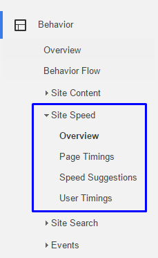
Image 1: Site Speed reports in Google Analytics
- Overview
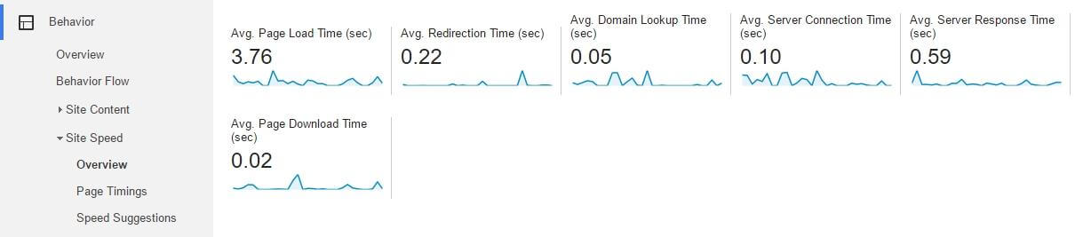
The Overview report shows a group of Site Speed metrics which can be used to track the speed and technical performance of your site. A list of metrics that you see in this report is explained below:- Avg. Page Load Time (sec)
This is the average amount of time it takes for pages from the sample set of pages to load, from initiation of the click on a page link to load completion in the browser for that page. - Avg. Redirection Time (sec)
The average amount of time spent in redirects before fetching this page. If there are no redirects before the page loads, the value for this metric is supposed to be 0. - Avg. Domain Lookup Time (sec)
This is the average amount of time spent in DNS lookup for this page. The lookup basically happens before the site loads and it can be longer if the content is being pulled from multiple domains. - Avg. Server Connection Time (sec)
The average amount of time spent in establishing TCP connection for this page. - Avg. Server Response Time (sec)
The average amount of time your server takes to respond to a user request, including the network time from user’s location to your server. - Avg. Page Download Time (sec)
The average amount of time to download this page. This represents a portion of the total page load.

Image 2: Site Speed metrics in the Overview report
- Avg. Page Load Time (sec)
- Page Timings
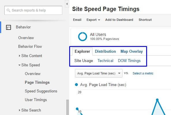
The Page Timings report gives you a detailed analysis of how your site pages perform individually and as compared to other pages on the site. There are tabs and subtabs available under this report as explained below:

Image 3: Various tabs in Page Timings report
- Explorer
Shows you the page data in the context of different dimensions. This has three sub-tabs:- Site Usage
Covers basic interaction metrics such as:- Pageviews
- Bounce Rate
- % Exit
- Page Value
- Technical
Gives a comparison based on technical metrics such as:- Avg. Page Load Time (sec)
- Avg. Redirection Time (sec)
- Avg. Domain Lookup Time (sec)
- Avg. Server Connection Time (sec)
- Avg. Server Response Time (sec)
- Avg. Page Download Time (sec)
- DOM Timings
Gives a comparison based on Document Object metrics such as:- Avg. Document Interactive Time (sec)
This is when the page is still loading, but the user can start interacting with your page. - Avg. Document Content Loaded Time (sec)
This is when everything in the DOM has finished loading.
- Avg. Document Interactive Time (sec)
- Site Usage
- Distribution
Shows you the timing buckets for different Site Speed metrics. You can select any of the available metrics in the report and see the buckets based on different time durations and understand the number of pages falling under each bucket. - Map Overlay
Shows you the geographic data in the context of different dimensions. This has three sub-tabs:
- Site Usage
- Technical
- DOM Timings
- These sub-tabs have the exact same set of metrics but displayed based on the geographic data instead of page data.
- Explorer
- Speed Suggestions
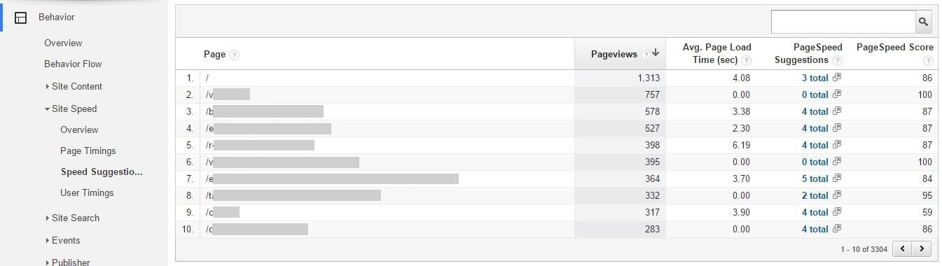
The Speed Suggestions report serves you with optimization tips tailored to your site pages. These suggestions should be taken into consideration while optimizing low-performing pages on your site.
Image 4: Speed Suggestions report
There are main two metrics for this report as shown below:
- PageSpeed Suggestions
This is simply the number of optimizations suggested to make your page load faster. These suggestions are served from Google’s PageSpeed Insights tool which also provides you with implementation steps for these recommendations. Very helpful! - PageSpeed Score
The metric indicates the extent to which you can improve page load time. A score nearing to 100 means less room for improvement. A lower score suggests that you should consider improving the page load time.
- PageSpeed Suggestions
- User Timings
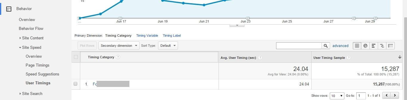
The User Timings report gives you the insights on how individual resources (for example, forms, images, videos, banners, buttons) on your website are performing with respect to user interactions.

Image 5: User Timings report
The three tabs present under this report are:
- Explorer
Shows you the page data in the context of different dimensions. The report has two new metrics as explained below:- Avg. User Timing (sec)
This is the average time for user interaction measured in seconds. - User Timing Sample
This indicates the volume taken into consideration for measurement.
- Avg. User Timing (sec)
- Distribution
Shows you the timing buckets for different User Timing metrics. - Map Overlay
Shows you the geographic data in the context of different dimensions.Note: You will have to implement Timing hits for all the user interactions that you want to track and see in User Timings report.
- Explorer
App Speed Report (for mobile apps only)
With the help of App Speed report, you can analyze how long your app takes to respond to user interaction requests. However, you don’t get to see data in this report if you haven’t done additional implementation to track the timings for user interactions. Implementation guides for user timing implementation are available for both Android SDK and iOS SDK. Once you have necessary implementations in place, you should see data in the below tabs in the report:
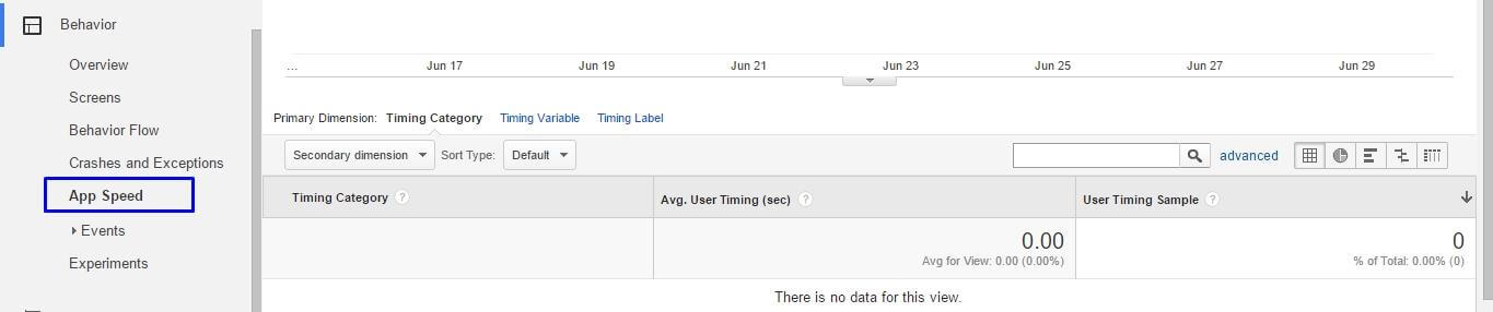
Image 6: Navigating to App Speed report
- Explorer
This tab shows the Timing Category dimension denoting to each user interaction you have tracked for load times along with the Average User Timing metric to show the average time it takes to perform the action. - Distribution
This highlights the User Timing Buckets for various ranges of the length of time (in seconds) which the tracked actions take to load. - Map Overlay
The tab gives a geographical distribution of Average User Timing metric. A lighter shade denotes shorter time to load and darker means longer time.
All the tabs under App Speed report uses the User Timing Sample and displays the number of users used while calculating the average length of time metric for each action individually. The sample rate for this report is set to 1% of total users by default.
Crashes and Exceptions Report
The Crashes and Exceptions report is a very helpful report which gives you an insight on what are the different types of exceptions your mobile app is throwing and how many times the app crashes either due to these exceptions or due to other technical errors.
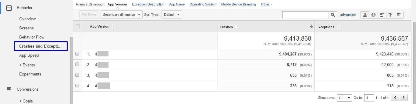
Image 7: Crashes and Exceptions report
The report gives you a brief description of the exceptions. Crashes are automatically parsed out from other exceptions.
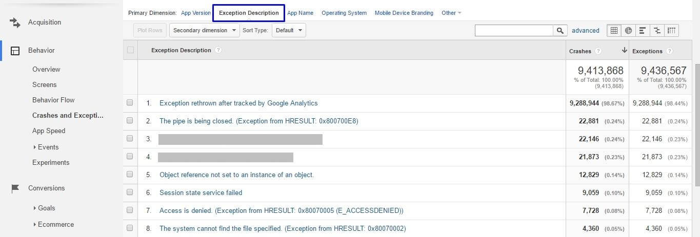
Image 8: Viewing Exception Description in the report
For more detailed exceptions, you should define additional exception types in the app tracking code. You can refer how to implement and define exceptions in the app tracking code for Android SDK and iOS SDK before you can see relevant data in the report.
Concluding the blog
I hope that these reports prove resourceful to you for detailed technical analysis of your website and mobile app performances. If there are any reports that you use for gaining insights for the developers, we would love to know about them. Feel free to leave a comment and tell us about it.