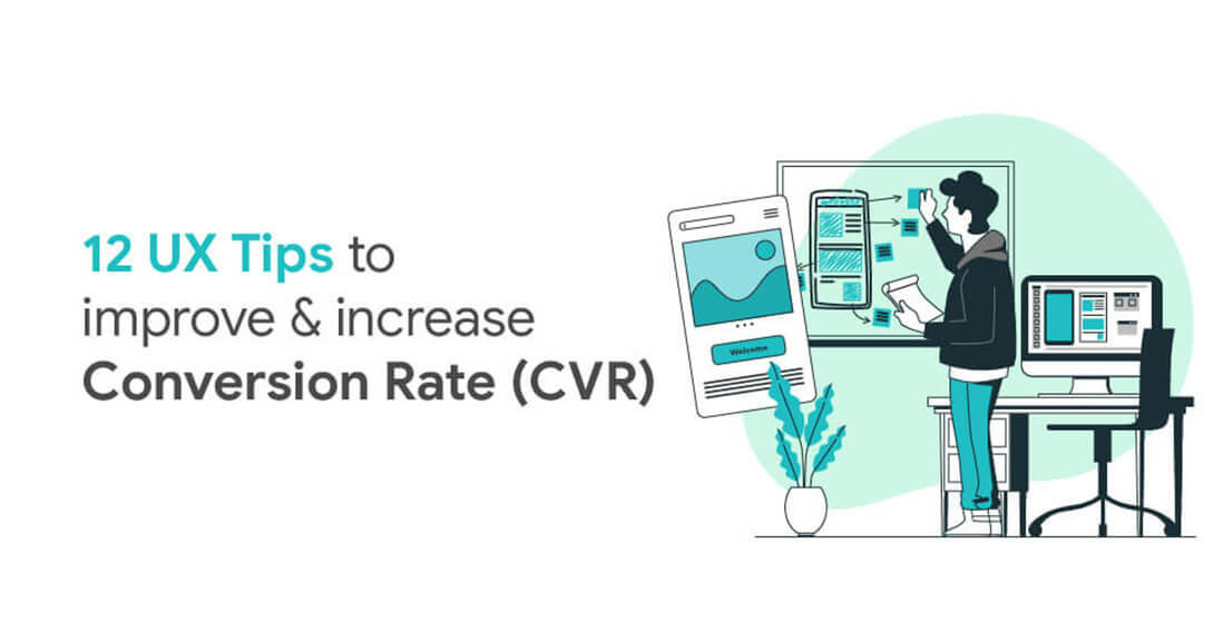
Good User Experience means a user-friendly interface that ensures that the user reaches their final goal on a website/app or a system with ease. Each little element, however minor, when placed on an interface comes together and plays a role in converting the users. Together all these elements own the user experience of the product.
Following are 12 UX tips that help in improving user experience and further increase conversion rate.
1. CTA (Call To Action) Button Design & Placement
Where you place your call to action greatly influences your customers’ UX. If CTAs are hard to see, read or click, then that has a negative impact on UX and conversions. The goal of many pages is to sell something—whether products, subscriptions, or signups. CTAs are integral to conversions and so is their placement.
There’s a lot of fuss around the internet about the significance of colour when it comes to influencing buyer’s behaviour. It’s commonly believed that green CTA buttons are more effective than red ones because green is usually perceived as ‘go’ and red as ‘stop’. Although there is some truth to this, a brand’s colour scheme definitely influences perception, but when it comes to conversion, colour doesn’t matter as much. What really matters is contrast and visibility.
CTA copy is a vital element of conversion optimization. Companies often forget to pay attention to what their CTA headlines and buttons say. How many times have you seen a button at the bottom of a page that simply says “Submit”? While this may be appropriate in some circumstances, CTA buttons and headlines provide a massive opportunity to increase conversion through a great copy.
Headlines that are particularly effective tend to include words that elicit emotion, create a sense of urgency and demonstrate scarcity. Why? Because a CTA written in this way will make your on-the-fence users (often a majority of your total users) most likely to pull the trigger and convert. When it comes to providing a quality user experience to visitors, call-to-action (CTA) buttons play a major role. Conversion, engagement, business, revenue, and profits of your business solely depend on the call-to-action button you provide throughout your website.
CTA along with specific colours can be a game-changer. Studies prove that CTA buttons with orange, red and green colours are more likely to be clicked by the visitors.
2. Quick Page Load Time
Today, more than ever, site speed is one of the most crucial determining factors in whether your UX is up to par or not.
Sites that are noticeably slower suffer from conversion losses compared to sites that are blazingly fast.
How do you know what’s fast enough, though? A classic study conducted in 2009 by content delivery network provider Akamai and Forrester revealed that 40% of consumers refuse to wait longer than three seconds for a page to render before they abandon the site. If your site takes three-and-a-half or four seconds to load, then poof. Your leads vanish along with your conversions.
A much newer study done in 2016 by DoubleClick by Google confirmed these earlier findings. When it comes to mobile, if pages take longer than three seconds to load, then 53% of mobile site visits are abandoned. Like mentioned earlier, you just have 3–5 seconds to impress a visitor. But if your website takes 10 seconds to load, then obviously, the customer would get frustrated waiting and look for some other site (mostly your competitors).
So, to give a great user experience to your visitors, it’s essential to have a well-optimized website.
3. Use High Quality & Original Photos
Images instantly lift up any webpage and make the content visually appealing. But, the type of your chosen image can make the overall design of the page appear good or bad.
It’s best to stick to this rule — Stay away from stock photos. While it is cheap and extremely easy to use stock photos it does more harm than good.
Stock images might look professional, but, within no time the users would be able to identify stock images and lose interest.
Original photos draw more visitors as they have a realistic approach to them and the user connects with them. Whereas stock images are overused and don’t create an appeal.
One more thing to be kept in mind is that using stock photos sends across a message that you have not invested much effort in designing the website. Also, it doesn’t look unique as they might have already seen it somewhere else.
So, always use authentic images, no matter how basic and simple they might look. Remember to stay away from stock photos
4. Content (Text) Visibility & Optimization
Consider the reality that your leads and visitors don’t actually read much of the copy on your site. According to UX Myths, people usually just skim site content. With short attention spans, it’s crucial that whatever little content they read is actually easy to read and interpret. If your copy isn’t comprehensible enough, they won’t know what to do.
What if I tell you white space or negative space of your website helps you to achieve a great website design. Yes, that’s true! In spite of being one of the most important aspects of website design, it’s still so underrated.
According to research, white space around text and titles increase user attention and provides a better user experience. White spaces make your content more legible and easy to navigate. However, you need to balance the use of white spaces with important information. It is proven that White Space increases click-through rates, as it allows the viewers to read/scan any data on a web page without the background clutter.
Therefore, keeping adequate ‘White Space’ on a website actually generates more leads and improves a merchant site’s conversion rate.
5. Easy and clear steps to check-out
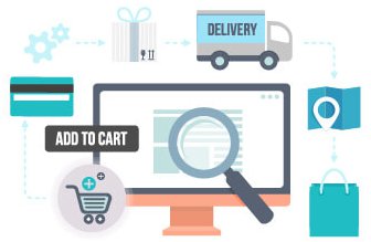
There’s a lot of debate among CROs on whether single-page or multi-page checkouts are better to convert. The truth is that there is no absolute answer to this question. In some cases, a single-page checkout process works well. In others, a multi-page checkout will do better.
For E-Commerce, it’s mandatory to reduce the steps of the checkout process. Most retailers, however, stick to a multi-page checkout process and never even try to experiment with a single-page alternative.
6. Guest Login works wonders
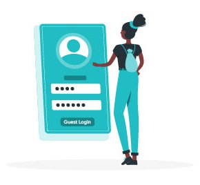
Your customers today are wary of sharing their private information with your site. They may like your products enough to buy them, but only a few of them would want to create an account and start a relationship with you. Yet, so many e-commerce stores continue to push mandatory sign-ups onto users. This has a disastrous impact on conversion rates since customers would rather skip buying altogether than deal with newsletters, promotional offers, and upsells.
Create a user account automatically when they make a purchase, assign a random password and send the information with the order receipt in their mailbox. Even if users choose not to register, you still want them to buy your products or services.
So do not force a sign-up on the checkout page.
7. Right duration of Animation or Transition
Animation draws the attention of users and it can control where they focus. This is great as long as the user is focusing on the right thing.
Animation at a wrong place and at wrong speed, becomes a distraction front the content.
When elements change their state or position, the duration of the animation should be slow enough to give users the possibility to notice the change, but at the same time quick enough to not cause waiting.
Among the moving objects of the same size, the first one to stop should be the object that has passed the shortest distance. Small objects in comparison with large objects should be moving slower since they make bigger offsets.
8. Avoid Bouncing and Motion blur effect in Animation
Animation is important because it enables us to tell stories and communicate emotions and ideas in a unique, easy-to-perceived way that both small children and adults can understand. Animation has helped to connect people throughout the world in a way that sometimes writing and live-action films cannot.
When objects collide, the energy of collision must be evenly distributed between them according to physical laws. So, it’s better to exclude the bounce effect. Use it only in exceptional cases when it makes sense.
The movement of the objects should be clear and sharp so do not use motion blur. It is difficult to reproduce the effect even on modern mobile devices and it’s not used in interface animation at all.
9. Use Easing effect instead of linear for animation
Easing helps to make the movement of the object more natural. For the animation to not look mechanical and artificial, the object should move with some acceleration or deceleration — just like all live objects in the physical world
Animation with easing looks more natural compared to the linear one.
10. Proper navigation throughout the site (Sitemap)
A recent online survey revealed that improving a website’s navigation may increase the conversion rate by 18.5%. Your website may stand out amidst the crowd of thousands of other merchant sites catering to similar services/products. However, you may lose a large number of potential clients if they experience difficulty navigating through your website and leave the site.
If your visitors are unable to use the website and navigate around to find what they are looking for; you lose the game and that’s a big NO.
Clean and simple navigation makes it easy for users to quickly locate what they need. So, here’s the idea: Think of what customers would look for on your site most frequently. Then make them visible. When potential customers look for something on your site but find it difficult to locate, they would be frustrated and would go away, probably straight to your competitor’s site.
11. Have Consistent colour palettes according to the branding.
If you’re designing a landing page or any page, you need to restrict your colour palette according to your brand. Too many colours can create a distraction and your user won’t know where to focus and give their attention.
When you limit your colour choice to just one or two but make use of their respective shades and hues, you’ll be able to create a design that is more balanced. As we said, colours are like emotions. Too many colours on a page and you’re going to overwhelm anybody who visits your website.
A good tip, stolen from the world of interior design, is to use the 60-30-10 rule. 60% is your main colour, 30% is your secondary colour and 10% is your accent colour.
It isn’t always the case that your UI colour has to align with the brand identity but it’s a good way to promote consistency in the UX design and improve overall recognizability.
12. Create Autocomplete and Search suggestion functionality
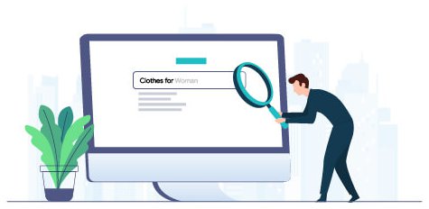
As users type, does your site search give them drop-down or autocomplete suggestions? These techniques can help your users find relevant search terms as well as reducing the time and key-strokes needed to execute a search. Users love it when the tasks they have to perform are made easier.
Autocomplete search allows users to click on suggestions and be taken directly to search results, thus decreasing the time needed to search.
The instant feedback given by autocompleting can help improve the overall user experience on the site, leading users to find what they need and convert faster.
By producing the keyword suggestions that are known to produce relevant results, the autocomplete feature considerably expands the likelihood of successful searches on the first try.