
In the online world attention is the currency. A business website, therefore, cannot ask the visitor to pay extra attention to find the company’s contact information. If not created right, the contact us page could lose potential business.
The page certainly deserves more attention while designing it. So your potential client doesn’t have to search too hard to reach out and connect. The relevant information should be upfront, concise, and easy to access.
Here are a few UX fundamentals to improve the user experience.
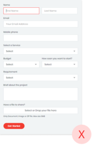
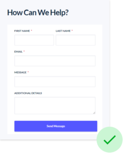
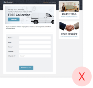
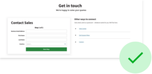
1.Contact form essentials
Place the form above the fold. So it is visible to the visitor immediately on arrival. Also, fewer fields will have more form fill-ups. Name, Email, the Business query is what you need to start with. An optional phone number may be. It’s better to point out the mandatory fields with an asterisk * sign.
A successful submission, form validation, and an error message will reduce the spam records If you do have multiple sections, save and submit each section. Highlight the active field that helps users to navigate throughout the form
Don’t
- No popups. It may divert the user’s attention while submitting the form
- Multiple dropdowns. It will increase the form drop-offs.
Please remember, website visitors are more likely to fill short and simple forms instead of complex forms.
2. Messages and personality
A big Hello, Join us, Get in touch, Happy to Help, are a few good phrases to start the conversation. Reflect your brand personality that will make the user feel more welcomed and cared for.
What to expect next. A message after successful form submission triggers a sense of accomplishment. The message what to expect next, in what timeframe improves user experience manyfold. You can send a short email with links to content on your expertise, authority, and trust, as an option.
Don’t
Do not overload your page with useless or irrelevant text & images. Remember, a confused mind always says no.
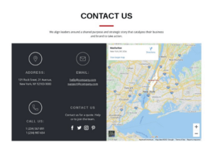
3. Postal Address. Store address
Traditional stores shown with google pin will immediately add actionable information.
For B2B, mentioning the physical address of offices with phone numbers and postal codes helps the user plan a trip or send a courier. It even builds trust. If you have multiple locations, having a store/branch locator functionality over this page helps.
Don’t
Leave old addresses and contact information on the contact page. It shows carelessness and lack of attention to details.
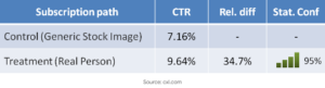
4. Be real and relevant with images
A relevant image of your services/ products can communicate your business objectives and value proposition with visitors. Use real people’s faces and team members to connect well. Analyst of NN Group found that users pay more attention to the real person’s photographs and other relevant images.
Don’t
Stock images to show team members are strictly a non-starter.
5. Social media connect
Social media links on your contact us page will give the user an option to know more and interact with your social pages. The importance of social media links cannot be emphasized more.
It helps create a sense of community, earns trust, and an easy 24×7 support access across the geographies.
Don’t
A broken link is detrimental in earning trust, not to say a lost opportunity to build community.
6. Interactive contact numbers and help/support Email IDs
Direct contact numbers to customer-facing team members and Email addresses can improve accessibility and leads.
An interactive chatbot, access to FAQs can improve action and interactivity. If you want to reduce the user’s efforts, make this information interactive. Thereafter users can contact you with just 1-click on the contact number and email IDs.
7. Call to action buttons
Direct contact numbers to customer-facing team members and Email addresses can improve accessibility and lContact form without a submit button is not possible. What CTA we define also affects the click rate. The buttons are the difference between a win and loss. So we better fix them. The idea is to improve the language on the button to project the benefit to the user, after clicking the submit button.
Here are options that you can use for better conversion of the contact us page :
- Submit to connect
- Send query now
- Get started now
- Free Consultation
- Talk to us
- Get free Demo
- Begin inquiry
- Get Quote
- Get a callback
- I’m interested in
- Let’s have coffee!
- Let’s connect
8. Add an interactive Map of your locations
Businesses that have traditional stores/offices must have an interactive map that helps users to reach the store easily. Google Maps is the best option to add interactive maps to your page. It also helps the corporate offices to demonstrate their availability of multiple locations.
9. SEO for Contact Us page
It is not a surprise that the importance of a contact us page underlines search engine optimization. Modern day practice is to instinctively use search engines for any query and information. Supplying your access information to help users identify where your office or store is located and how to get in touch is non-negotiable.
So it’s only natural to make this information accessible to customers without even visiting your website. Search engines like google and bing have made this possible. Search Engines allow businesses to include their contact information in search results. And supply detailed instructions on how to connect and reach.
One bonus tip is with regard to A/B testing. The testing helps determine if our choices really are improving the user experience. A/B testing shows two or more variants to a set of users, based on the behaviour and responses a choice is made. Check how one of Tatvic’s clients Angel Broking gained 53.5% more leads after A/B testing results guided them to change the colour of their CTA.
We are here to help.
Whether you’re an SME or a large enterprise, customer experience is your goal. It is important that we help the user as deeply as possible. Even before they turn into clients or customers. The opportunity to leave the right impression is key.
A good Contact Us page would bring a lot of traction and nudge your customer to take the required action. Book your slot for free Conversion Rate Optimization Assessment here.