
By incorporating heuristic evaluation into the CRO process, we bridge the gap between data-driven analysis and the need for quick, actionable insights. This dynamic combination allows us to make informed decisions that lead to significant improvements in conversion rates, user satisfaction, and overall business success.
As a CRO expert, I highly recommend integrating heuristic evaluation into your optimization strategy. Embrace the power of this efficient methodology and witness the transformative impact it has on your website’s user experience and conversion rates.
What is ‘Heuristic Evaluation’?
Heuristic evaluation is a process of measuring the usability of the user interface based on specific predetermined rules; the website/ app can be examined by the rules and report the issue.
Here the term usability is related to how a user perceives your website in terms of affordance, discoverability, learnability, flexibility, efficiency, speed and user control. The application of these components in a good manner will become necessary to improve the overall conversion rate.
If we apply this evaluation process to early-stage prototypes, it will be more beneficial for developing a good system. Because heuristics developed after years of experimentation on various types of e-commerce, business, blogs, and news websites.
As a result of all these experiments, A model was developed that will evaluate what will work for a system conversion rate optimization. The model has certain rules of thumb that we can apply depending on the type of website and perform an A/B test to measure the conversion rates.
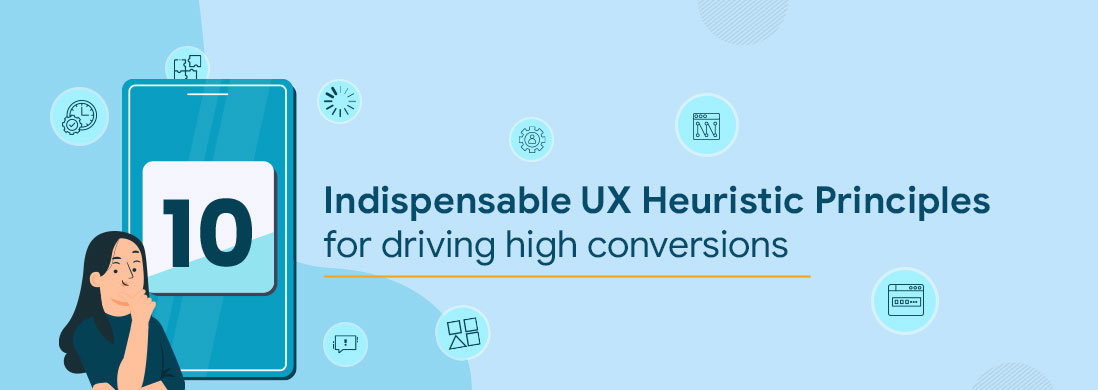
Heuristics Principles & Their Application
There are multiple rules of heuristics in which 10 general principles are widely used, first proposed by Jakob Nielsen in 1994, Depending upon the purpose of the website or app, some of the principles can be removed. We can understand the application of these principles with examples.
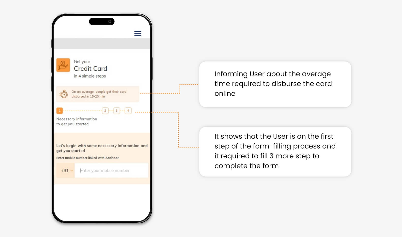
1. Visibility of System Status
The system should give real-time information to the user about what is going on in the system with appropriate feedback. The user always expects clear communication in advance before taking any further action.
Also, the system is not allowed to take any action on its own without prior notice to the user. The crystal clear information will increase the trust of the brand/ website, which is necessary for a user to take better decisions.
For example, In a bank credit card application form. The user is provided with real-time information about form filling status.
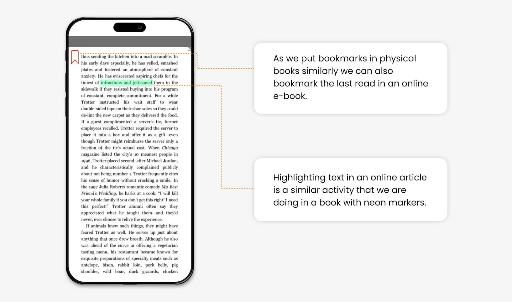
2. Match between the system and the real-world
Design should speak about its purpose in the user’s language. If you design something, its language, iconography, and images can seem perfect for you and your colleagues, but that is not always true, it might be confusing for your end user.
The information delivered in the form of real-world conventions is more persuasive and easy to understand for a user without any language barriers.
For Example, We can bookmark pages and highlight the texts in e-book apps as we do in physical books.
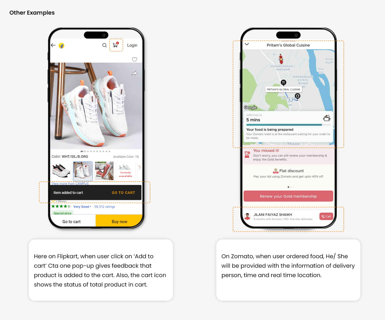
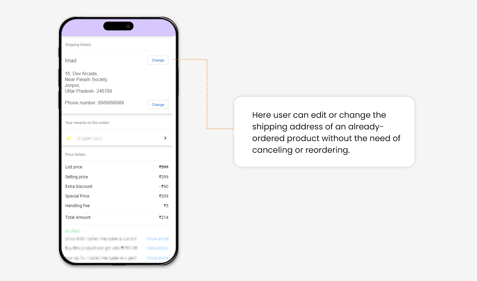
3. User Control & Freedom
If you are writing something with a graphite pencil, An Eraser will help to erase it, In case you have written something by mistake. Eraser gives you the control to correct your written text.
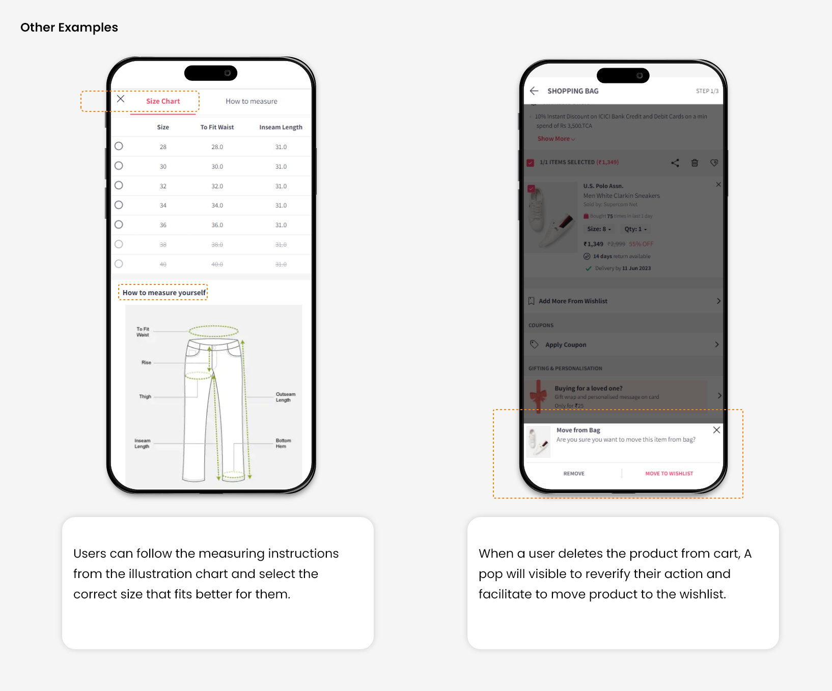
In the digital world, Several times, users perform actions by mistake, so they always want control to correct them. In such a situation, users should provide a clear exit or solution without getting stuck to avoid frustration.
For Example, On an e-commerce website, many times, users save multiple addresses in their address book, which increases the chance of selecting the wrong address during checkout. So it becomes necessary to give control to the user for changing shipping address after making a successful order.

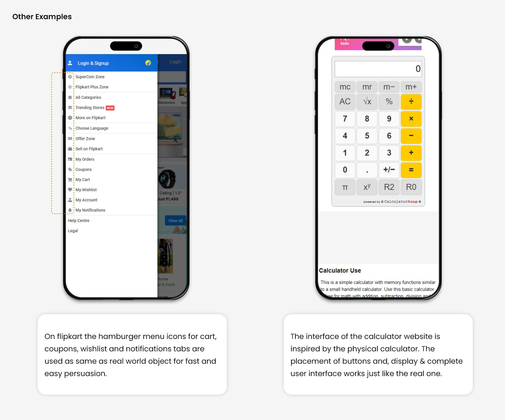
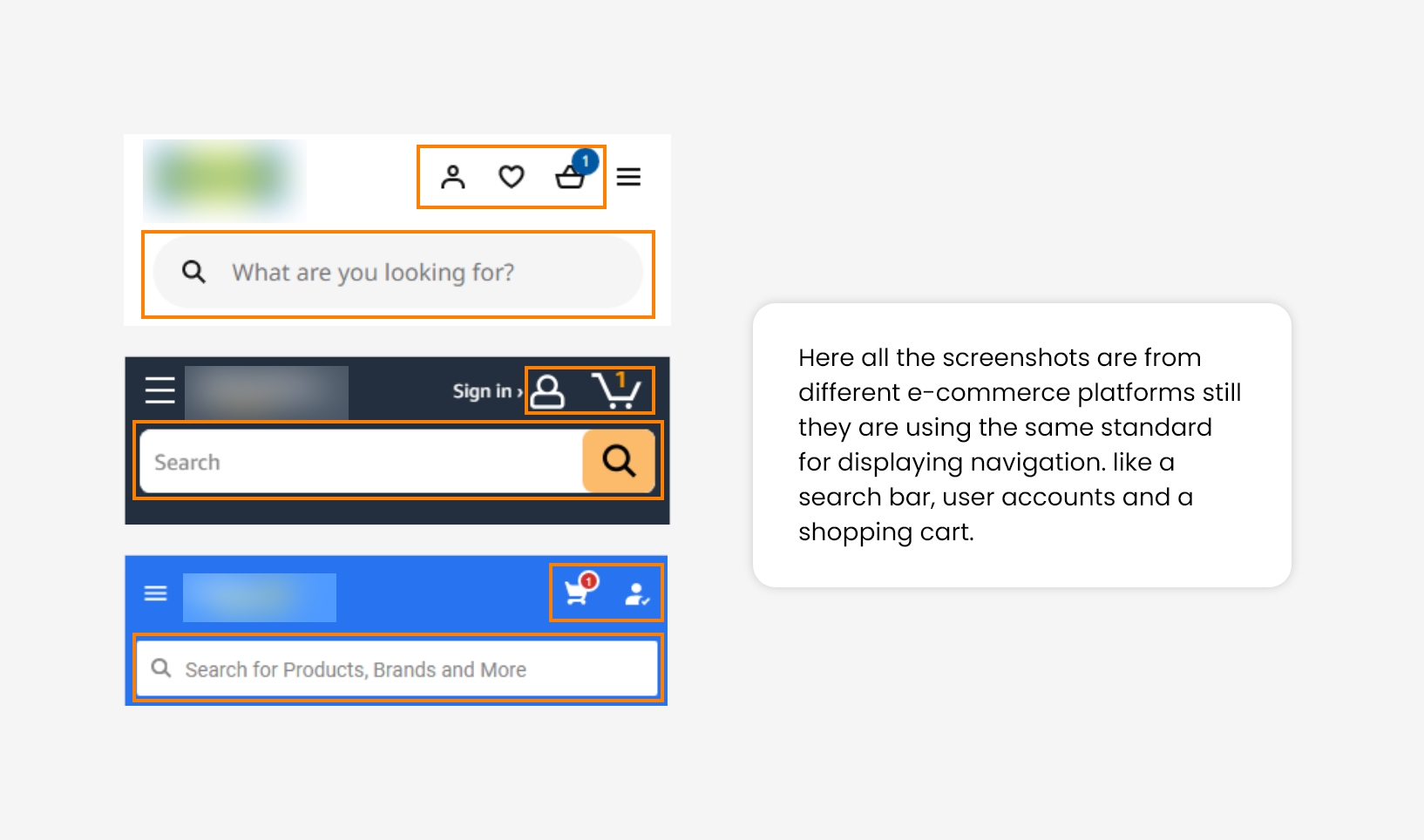
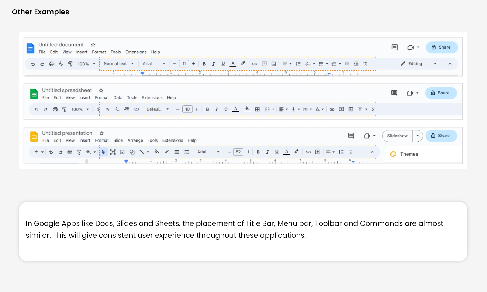
4. Consistency and Standards
This principle very much relates to Jacob’s Law of UX design. It states that users always spend more time on other websites than yours.
So they always expect the discoverability of elements and functionality of your website should work in the same way as that work on the other website.
Users developed this behaviour on their own, Through their years of exploration of different websites. It helps them to perceive different elements or find specific functionality on a landing page with ease.
For Example, Most e-commerce websites use the same standard for showing navigation elements. We have observed that maintaining consistency across websites will reduce user bounce rates at first glance.
5. Error Message
Error messages are important to warn users prior to their action, but good design always aims to prevent problems from occurring in advance.
If the user commits any error or attempts something wrong, who will take responsibility for this? User or Designer?
So, the answer is Designer. He designs the system in such a way that it becomes easy for a user to commit the error. The conclusion is that the System is always designed in a way that it becomes less prone to errors.
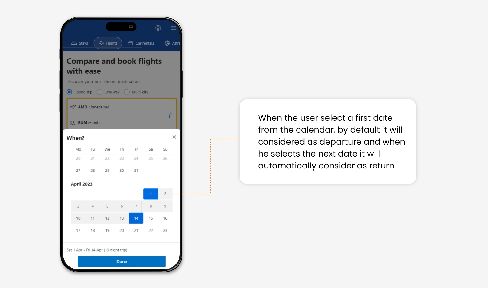
For Example, On flight booking websites, many times, the user makes the mistake of selecting the return date before the departure date. For a good user experience, a constraint can be added in the calendar that can avoid users from selecting any redundant date range.
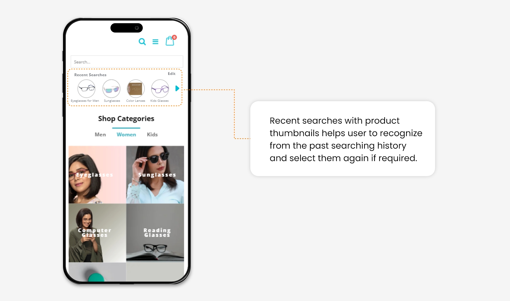
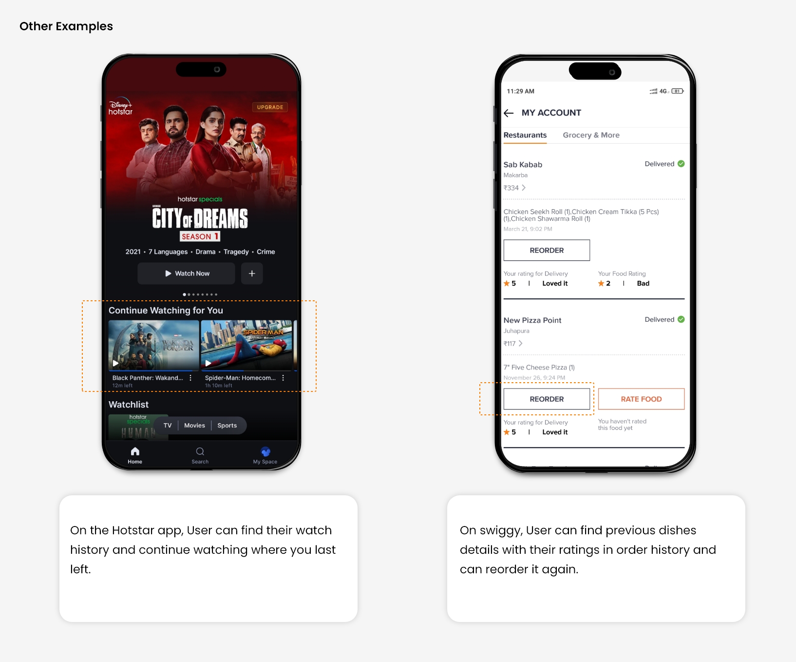
6. Recognition rather than recall
While people cannot remember every detail of an event, they are capable of retaining specific parts. However, the act of recalling information can be burdensome on the memory.
Designers need to reduce the user’s memory load by making images, elements, and options visible at first glance.
For Example, Once people search for a product on an e-commerce site and leave it. When they return and try to search again, it will be good to show them their search history. Because they are most likely to buy things from it that increases the website conversion rate.
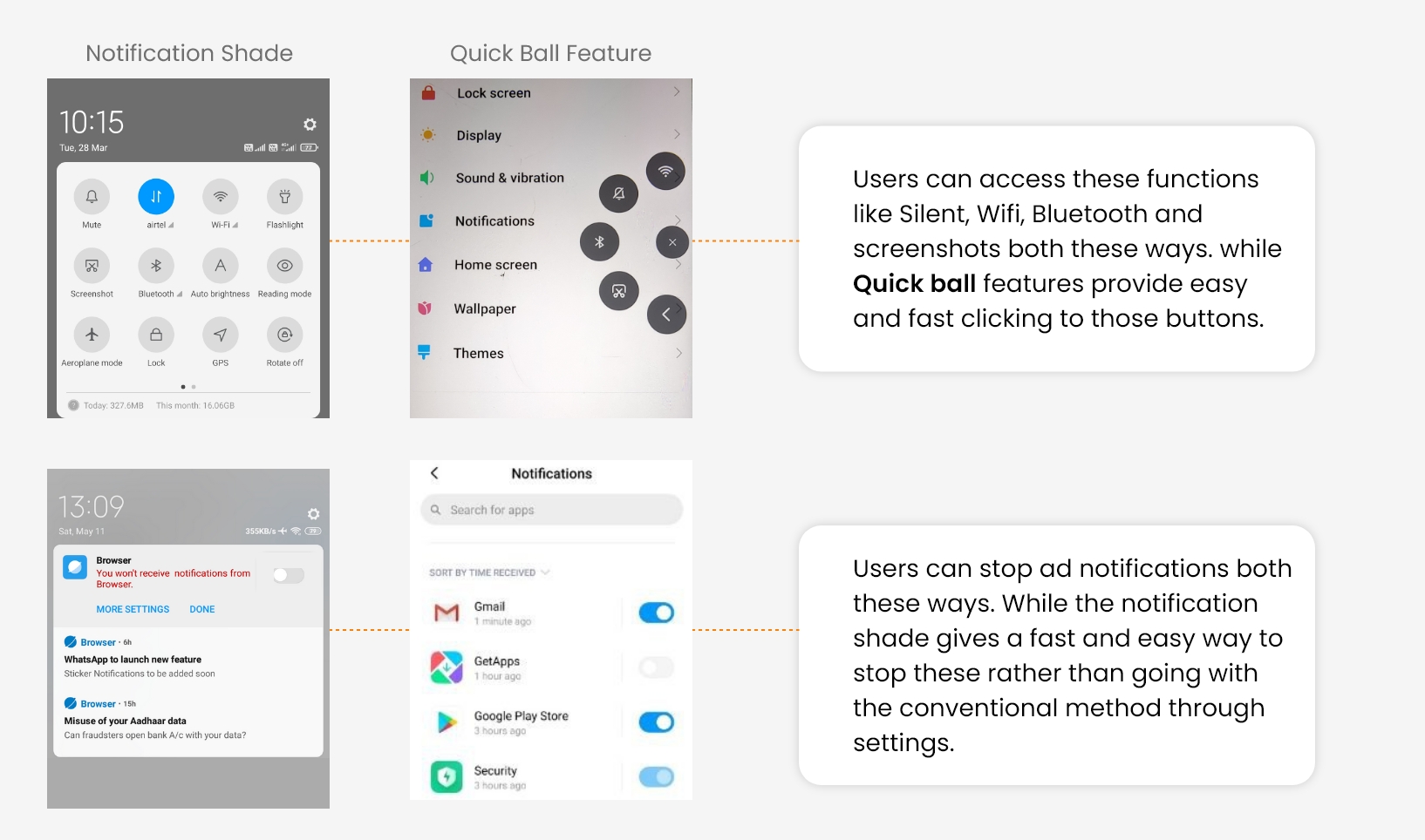
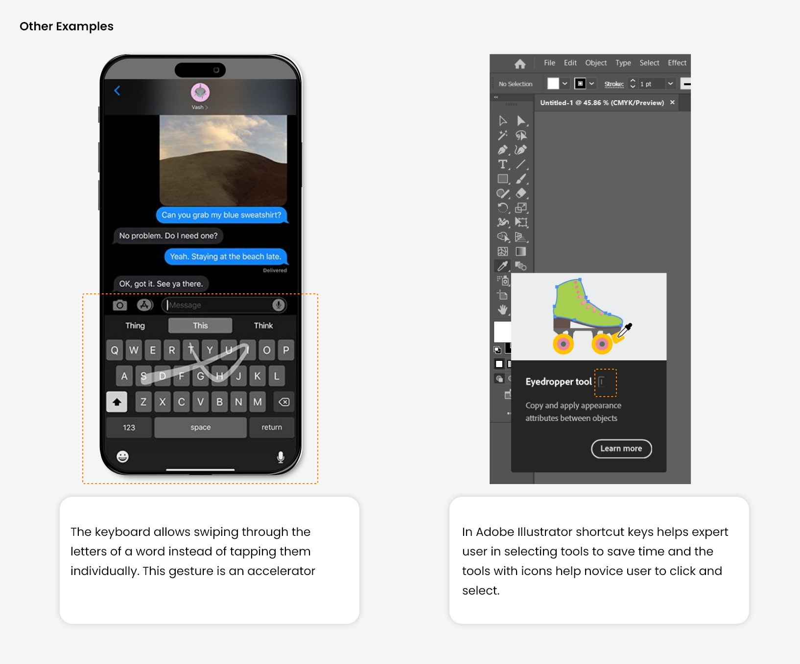
7. Flexibility and efficiency of use
There is always two types of user, Novice and Expert. The expert user wants some facility that speeds up their work, like shortcut keys.
Where a new user wants a simple and easy functionality, the designer needs to cater to both segments of Users so they can work efficiently. Also, provide the facility of personalization and customization as per user need.
For Example, In mobile UI design, different quick access (Shortcuts) is provided for fast and easy navigation throughout the UI. It will save the user time and improve their overall experience.
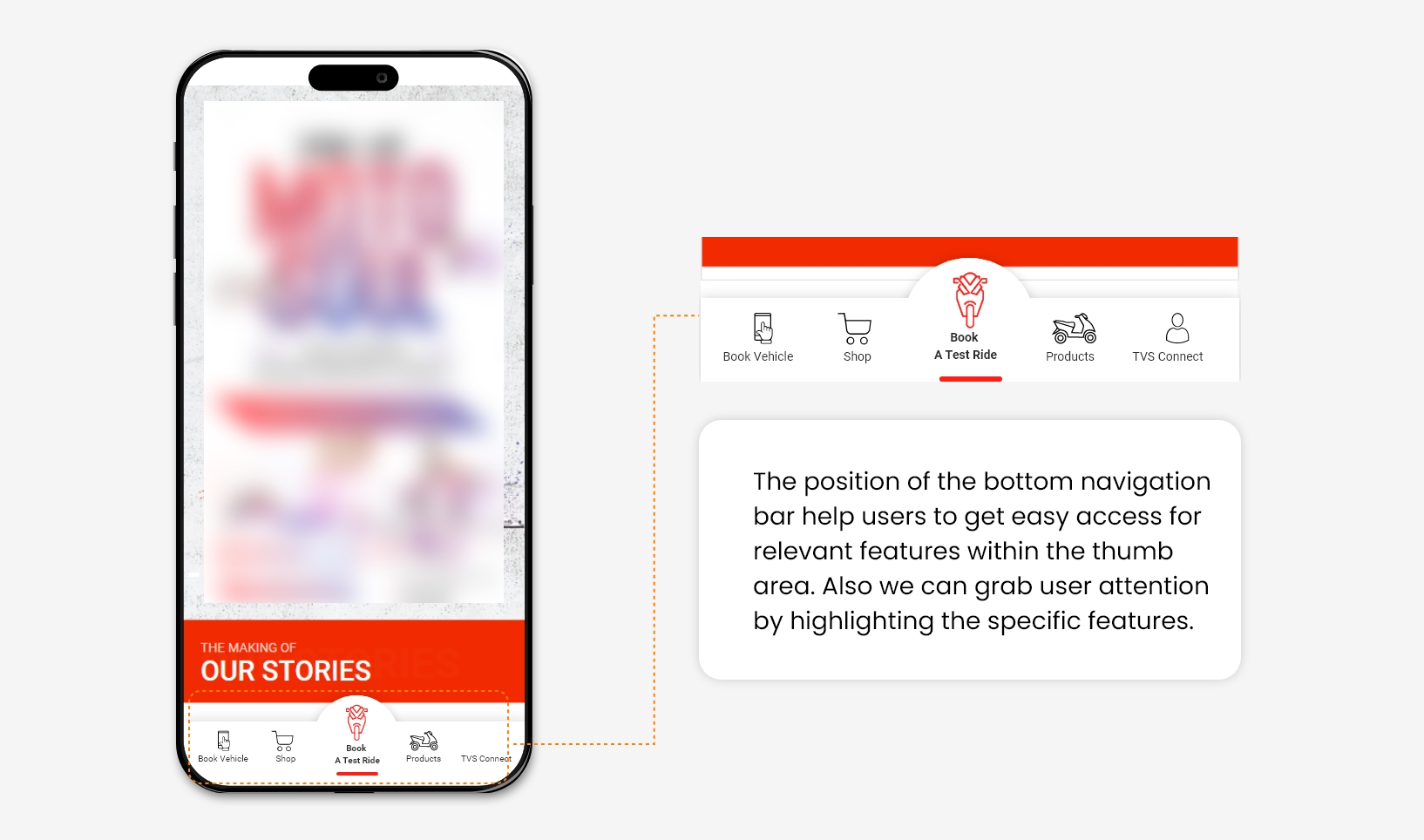
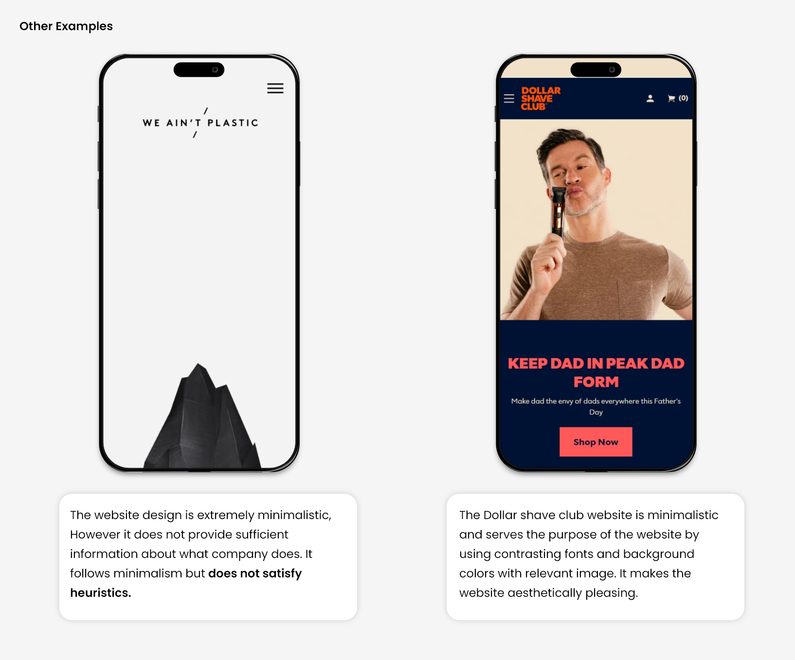
8. Aesthetic and minimalist design
Many time system contains lots of elements and information In which, some of the contains are irrelevant and rarely used. Such content distracts the user’s focus from the relevant and necessary information.
As a result, the user will not be going to perform the task that you are supposing from him. So, Before designing, you need to prioritize the visibility of primary and secondary elements on your landing page or interface.
Let, An interface that showcases only minimalistic design but does not contain relevant information and visa-versa, a page with relevant information not presented aesthetically will not be considered a good heuristic approach.
A good design would be well-presented information with the use of design and gestalt principles.
For Example, Giving a Navigation bar on the App at the bottom rather than on top with the most relevant options will help users discover specific buttons quickly.
9. Help users recognize, diagnose, and recover from errors
Design should always focus on minimizing user errors. Still, due to some design problems or any functionality issue, the user will get stuck in some error. Now it’s the designer’s responsibility to give a complete and simple direction to resolve it to recover.
When a user makes a mistake and doesn’t get any feedback to solve it, they would most likely skip the task they were supposed to perform. Also, showing custom-written error messages is a good practice rather than system-generated error messages with code like ’404’.
Hence, Error messages are always kept in a simple language, which can be easy to perceive and also suggests a constructive solution to resolve.
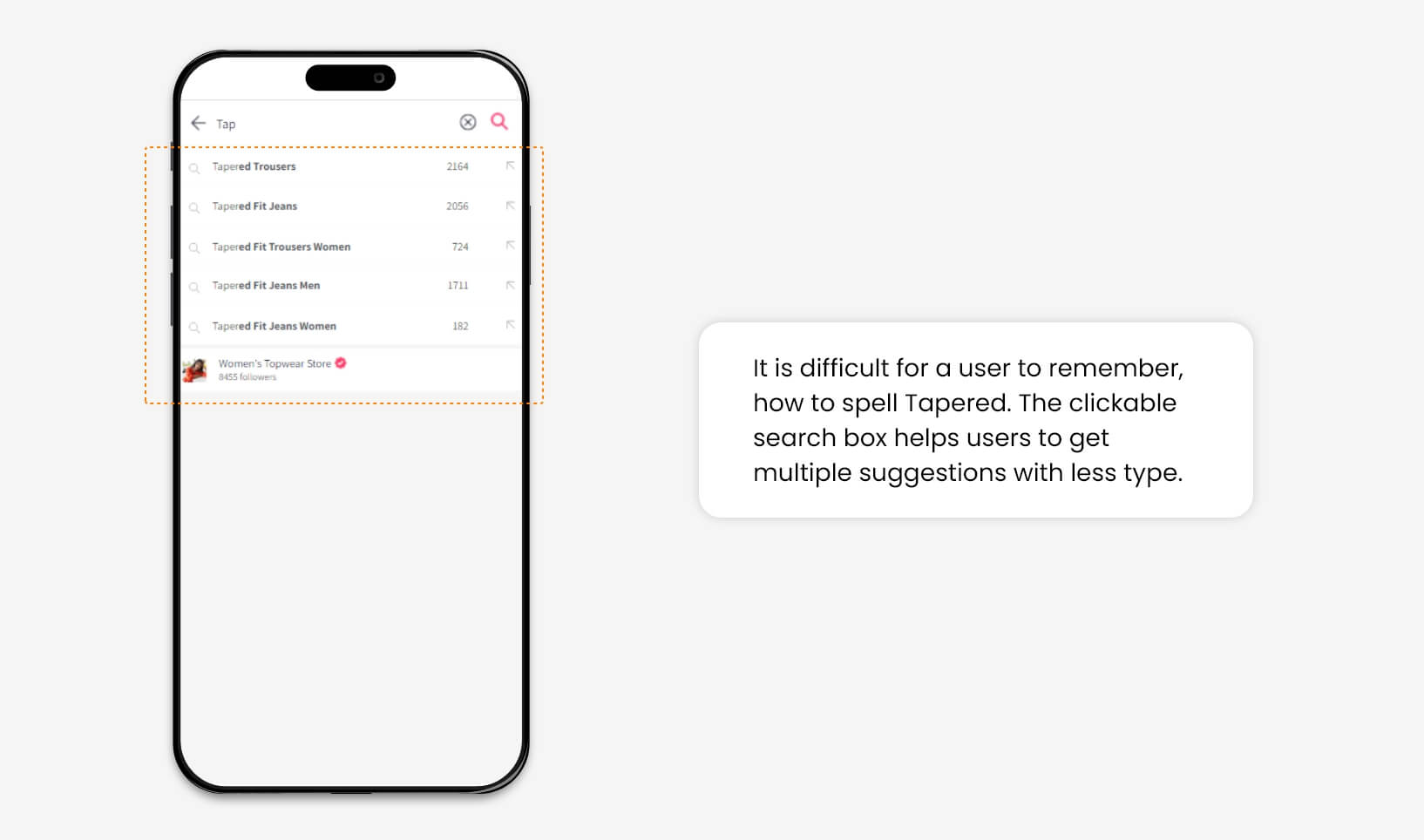
For Example, On an e-commerce website, sometime user forgot the specific keyword of the product for which they are looking to browse or purchase. The search option facilitates multiple suggestions once they initiate typing, which helps the user to recall the product’s actual name.

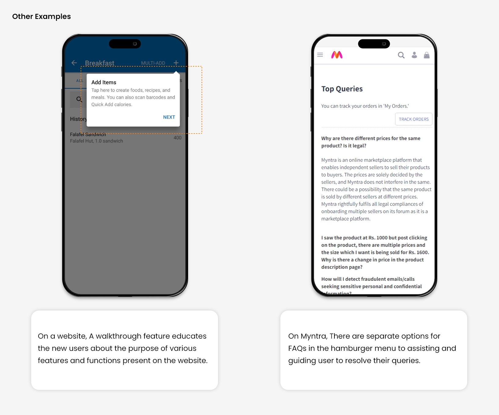
10. Help and Documentation
Designing a system in such a way that it becomes self-explanatory. It won’t need any additional explanations. However, It is good to help users by providing relevant documentation to accomplish their tasks.
There are two types of help one is Proactive, and the other is Reactive. Both this type of help is widely offered at different online platforms.
Proactive help focuses on preventing issues in advance. It provides help to the user before he/ She encounters a problem. It is intended to make users familiar with the interface by showing some tips, suggestions, and training tutorials.
While Reactive help stands for helping users when they have already encountered a problem and seeking a quick solution, it includes some advisory documentation, videos, and well-segregated videos for specific issues that are easily accessible.
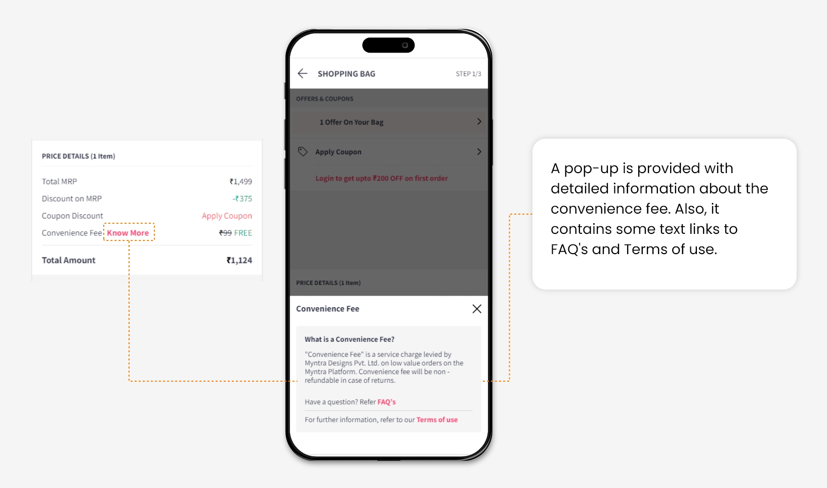
For Example, At the checkout page of an e-commerce shopping website, a convenience fee is charged. So It is necessary to inform users why it is supposed to be included in the Total amount. By clicking on “Know More’, A task-specific help document will be provided.
Conclusion
All these minor changes can enhance user experience and help us to increase user engagement on your website.
In many A/B tests, we have applied changes according to heuristics and observed that consideration of all these principles while designing the website interfaces gives better results in increasing the Overall conversion rate of the website.