

User Experience is one of the main elements that differentiate you from your competitors, both physically and virtually. To increase your conversion rates you might need to completely change your UX. The question is: Where do you even start? How do you pinpoint what your users and prospects want?
It’s pretty easy to make excuses and say you know what users want without any research or investigation. You have to be a learner, humble and smart enough to draw conclusions through data analytics for a better customer experience. Let’s start at the bottom – Google Analytics. This blog post will help you extract insightful, actionable data.
After reading this post you’ll be able to see each component and extract data from the same.
The four basic analytics components that will help you work on your UX are:
- Bounce Rate
- User Behaviour
- A/B Test
- Customer Surveys
Bounce Rate
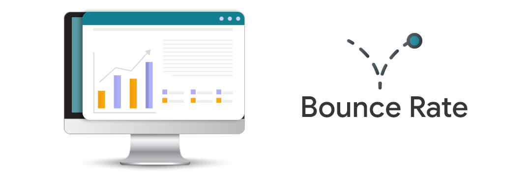
In simple terms, the bounce rate is when a user lands on your website and leaves it without interacting with the page.
Having a bounce rate of over 70 percent is something you don’t want. That’s like 70 out of 100 visitors didn’t find the info they were looking for so they exited the page. You need to check your web pages for the following issues:
Navigation Issues
Website navigation is like a funnel. It should be properly organized and grouped. Ideal navigation would be something that a user can predict. Having complicated and unorganized navigation will only create confusion with your website visitors.
The best way to find out issues with the navigation is to see if users are clicking on each item. If they aren’t, consider dropping some items or think about restructuring it all together.
User Behaviour

Whenever someone visits your website and does something, it’s called user behavior. It includes the journey within the pages of your website, and the actions they take through form submissions and link clicks among others.
Analytics helps you understand the user behavior of your website in a much better way than just guessing. With user behavior metric you’ll know which part of the page is the users interacting with, what forms are being used consistently, are there any pages people don’t even care to visit? Optimizing your website after knowing the user’s behavior will help you increase engagement and convert your prospects in a much faster and better way.
Your Visitors
User Journey will enable you to see the bounce ratio, drop-offs, and exit pages, enabling you to improve user experience. If you see a high bounce rate on your service or product page you need to re-think your page design and content. On the other hand, if you see a few people visiting those pages, you might have some issues with previous pages leading to that page.
Acquiring new users and converting them might sound cool but converting the returning users is of a much higher value as well as a low hanging fruit as well… They’re deeper inside your sales funnel as they know your website, content, and services. New visitors are just getting started on your website. Lower the returning visitor session higher are the issues with your website UX.
Time Spent on Website by Users
Time is another important thing to look at. It’s important to understand how much time a user spends on your website and pages. A user spending more time on a page might be a positive sign. The word might here indicates the possibility of users getting confused or having no clue what to do next. Your users should be able to predict the next steps. If they aren’t, maybe, they didn’t find the information they’re looking for. If you see this happening, take action immediately.
What should you do?
Make sure all your links and CTA’s are working. Also, make sure the page with a high bounce rate has a uniform UI design and a right CTA in place. Use heat maps in Google Analytics to make sure users are viewing the complete page and taking relevant actions.

Red areas represent more clicks, while blue indicates less. If the users are moving too quickly around the page there might be missing information or image on the page. Check the interaction, time spent on the page and content you have above the fold. Change it and use A/B test to measure results
Customer Surveys
Customer Surveys are a great way to get specific answers from your end-users. It helps you optimize the UX based on real feedback. If you have a high bounce rate on one page more than another, asking your end users a specific question might help.
Let’s say you have created a web interface following the standards of the industry. But possibly that design is not working for your audience. In this case, observing the heat map analysis might be of no use, but reaching out to your users would definitely help.
For instance, the red color might not work in the western world while in Asian countries it might be one of the strongest colors to follow. Every company conducts surveys when they update their designs or launch a new product. This helps them serve their end-users better in terms of design and content.
A/B Testing
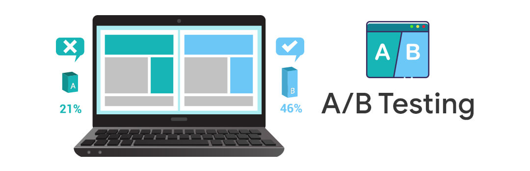
Analytics helps you pinpoint the lagging parts of your website. Now, you need to create a design strategy to address those issues. Start by making a list of elements to be redesigned. A/B testing is a strategy you use when you want to apply those changes to the pages of your website. Making all the changes at once is a bad idea. Instead, we would recommend you to first change the fold section and alter the CTA design. You can always start with pages that see high engagement but also have a high bounce rate.
Your new design will become the part ‘B’ or the variant of your original design. You can then set up an A/B test on your website or app and send some users to the new design. Then measure what works well.
The best way to measure is to compare both the variants & basis your experiment goal – which is to increase engagement in this case, then obviously the one with better engagement and lower bounce rate is the winner.
An ideal A/B test would involve
- Identifying the flow & creating a hypothesis
- Creating a new design based on the hypothesis
- Run the experiment to measure engagement and bounce rates
- Repeat the strategy until you get a result with expected figures.
The Bottomline is…
Analytics can help you understand your end-users in a better way. You can always trace the parts that are causing issues via website interaction, bounce rates, engagement, among others. Fixing these issues will enable you to improve engagement and conversion rates on your platform.
Get an audit of your Google Analytics today!