

‘Simple but yet visible enough, actively impressive’. A way to build a mobile call to action buttons usable and therefore boost their effectiveness, as well…
The CTA’s are very relevant for marketers because they encourage the audience to take action on a marketing campaign and ultimately, the goal of any marketing campaign is to guide the audience so they can make a Conversions.
Once you identify the needs of your target audience. As long as your CTA is tailored to those needs, then you’re on the right track.
There are typically three best practices that pop up consistently for effective CTA’s.
1. It should appeal to the user’s requirements.
Your call-to-action should explain what will happen when the user clicks on it. It should make them feel confident that they will get exactly what they need by clicking on your CTA.
2. Make CTA easy to find.
Your call to action should stand out against the rest of the page. It should be easily visible so that users don’t have to search for it. A good practice is to use contrasting colors and bold fonts for your CTA button.
3. Guide the user to the next step.
Your CTA should be clear and concise. It should guide the user to the next step in their journey toward achieving their desired outcome. Use simple language that is easy to understand and encourages users to take action.
How to know that current mobile CTA’s are not optimally designed for mobile devices and adapted to mobile users’ specific UX requirements?
If users are spending too much time on the action screen, it’s not obvious enough for them which is the highest priority to take, and users will struggle to find the CTA on a page because it was too cluttered with heavy text, images, too many options overloaded in there, wrong placement, other design elements, etc.
Here are the 7 Effective tips for the types of CTA’s to make your mobile call-to-action buttons more effective.
-
Research:
To create a good call to action, you must find out everything about the target audience like whom you are targeting for your product or service. When making CTAs, start with an end goal in mind. For example what action do you want your audience to take in what stages? Whatever the goal is it should be straightforward and specific, offering multiple choices might confuse the audience and affect your conversion rate.
-
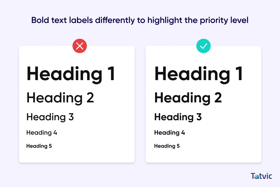
Bold text labels differently to highlight the priority level:
Adding a bold font on each text label will put the same amount of attention on them. So it’s better to emphasize each text label differently based on the priority. A very easy and powerful technique that CTA needs to stand out and build an impression. Indicate the hierarchy of priorities using varied intensity when you bold the text labels go from the least bold to the boldest. This way, it will put a different emphasis on the various actions referred to.
-
Colors make a huge difference:
Colors matter a lot when it is about to reach a massive CTR. Buttons and background colors should be contrasting enough so that CTAs would stand out from the other UI components and elements. Use the same color, but with different levels of saturation and brightness. This small tweak can make the medium priority button lighter in visual weight than the high priority button.
Some studies have also shown that the use of bright colors with contrasting backgrounds tends to receive the highest click-through rate.

Ensure to use brilliant contrasting colors that stand out from the rest of the background. Also, it all depends on the design of the website.
Always apply the AB test with different colors to see which color can give the better CTR because there is no exact answer about which works better.
-
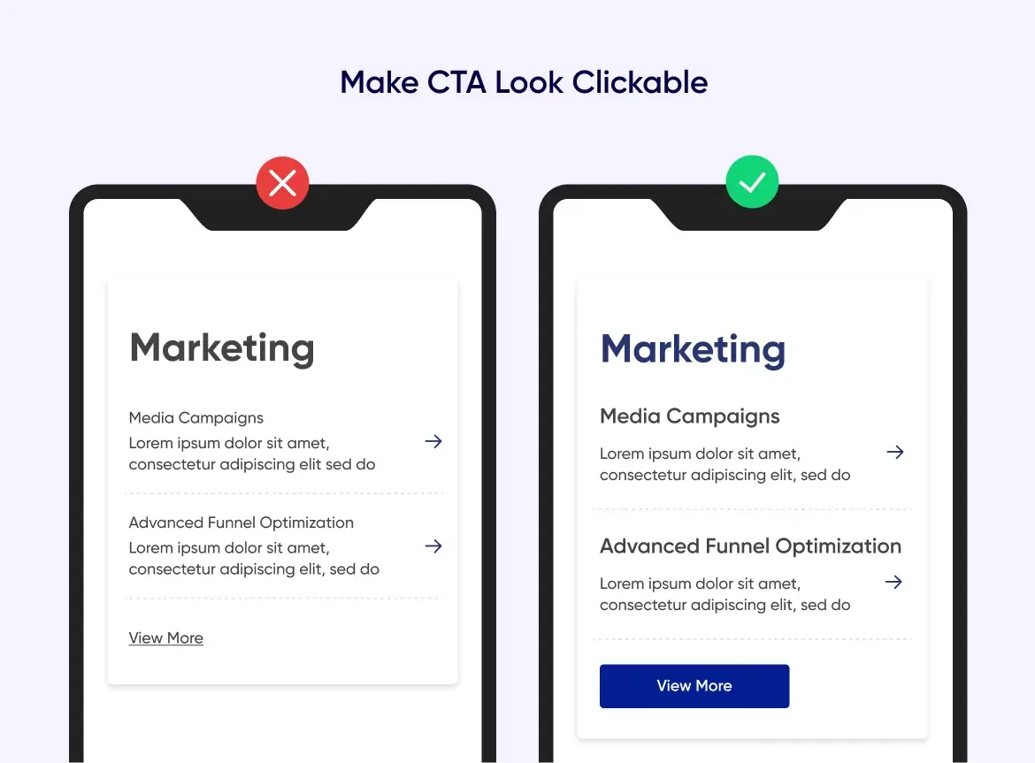
Make CTA look clickable:
When designing the mobile call to action button, go for the button shapes instead of text-only buttons, because this might be confusing to the user: “Is that a button or it’s just a piece of information” and this can be the reason for skipping CTA because the user won’t notice it or just take it for the copy. So in other words place the text labels into attractive and familiar button shapes.
Don’t rely on one shape, depending on the landing page, different button shapes could entice different users. For example, rounded shapes or simple elegant rectangles for the homepage buttons.
The CTA must be big enough to draw the user’s attention instantly and also make it easy for the user to click on it so try to make them stand out among the other buttons on the screen. Large button sizes have a high chance of being noticed and quickly found on the screen but they shouldn’t be too big so that the visual composition and the consistency of the whole layout won’t be spoiled.
For example, a CTA with a little shade of gradient or a small light shadow can usually bring the desire to push a button since it looks more primary and noticeable.
Also, this depends on the whole page design, if the 3D effects gradient style doesn’t suit the page style then go with the flat design and clickability can be emphasized with the rounded edges of the button.
Apart from the shape and size of the CTA, text size also matters for mobile. The text size has to be large enough to attract users’ attention, but don’t want it to be overwhelming. Also, putting an icon on the high-priority button adds extra emphasis to set it apart.
-
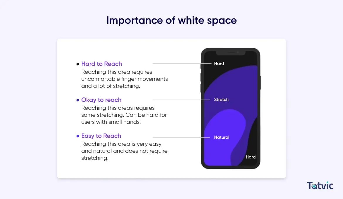
Use white space as a tool to make CTA’s stand out:
White space, also known as negative space, is the area between elements in design composition this has a great role in the space to pay a lot of attention to it. Try to remove choices and do not overcrowd with too many CTAs on one single page, if you give users too many options, you risk confusing and overwhelming them and making the decision-making process complicated. Limit the call-to-action buttons to just one or two options in proper order to avoid decision overload.
So make sure to don’t overcrowd the screens with multiple CTAs. Instead of that place just one important CTA per given space.
White space is not just an empty canvas. It’s a powerful tool to emphasize UI elements.
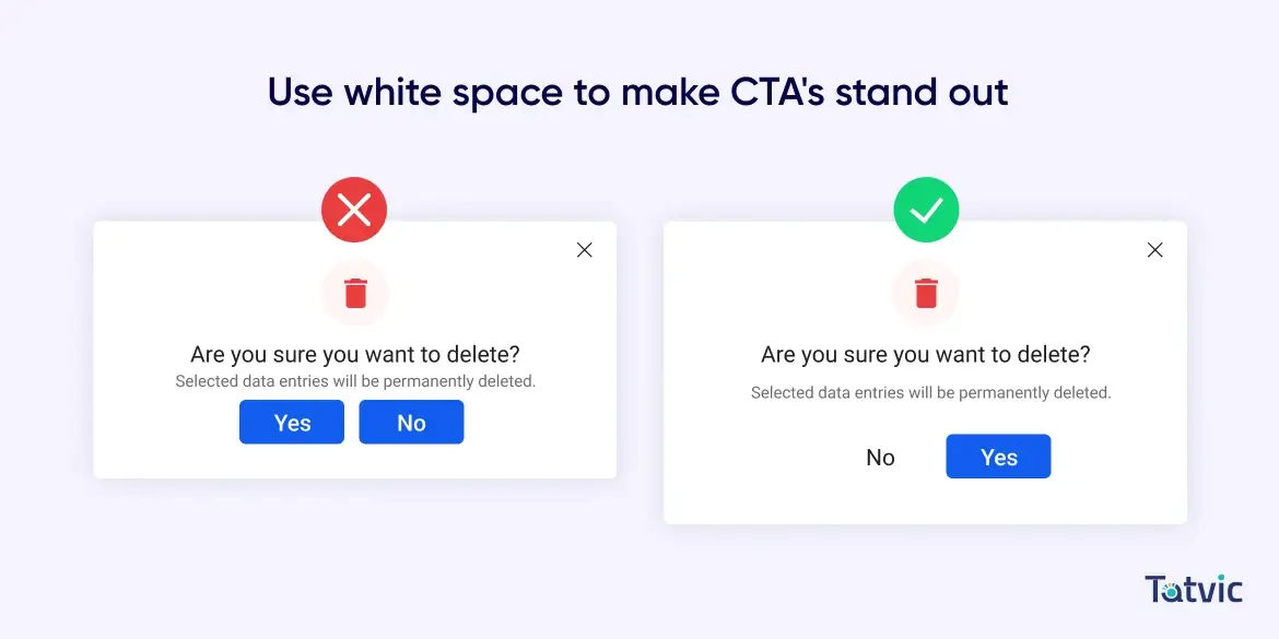
Remember that white space doesn’t refer to an empty white background and it doesn’t necessarily have to be white it’s just the name to indicate spaces where there are neither UI elements nor specific content. Also, It can be any texture, color, background image, or pattern as it refers to the design background.
White space not only creates balance and helps in brand designing but also improves the visual hierarchy, gives visual communication between elements and adds style and elegance to the page. White space removes distractions and helps the user to focus on important aspects and improve the CTA’s readability.
-
Keep user flow in mind according to the scanning pattern when placing the CTA’s:
When thinking about the UX, it’s also important to think about the user flow or the user journey throughout the page. Placing the CTA button in the most appropriate place will impact the user experience. Placing the main CTA button first might break the user’s natural scanning pattern. Because of that users have to go below and then reverse their scanning direction to go to the main action CTA. And this is not their natural flow: first the “checkout” button, then the “view cart” and then the “keep shopping”. This makes the UX bad and breaks the whole user flow throughout the page.
Instead of that, the hierarchy should be reversed: first “keep shopping”, then “view cart” then “checkout”.
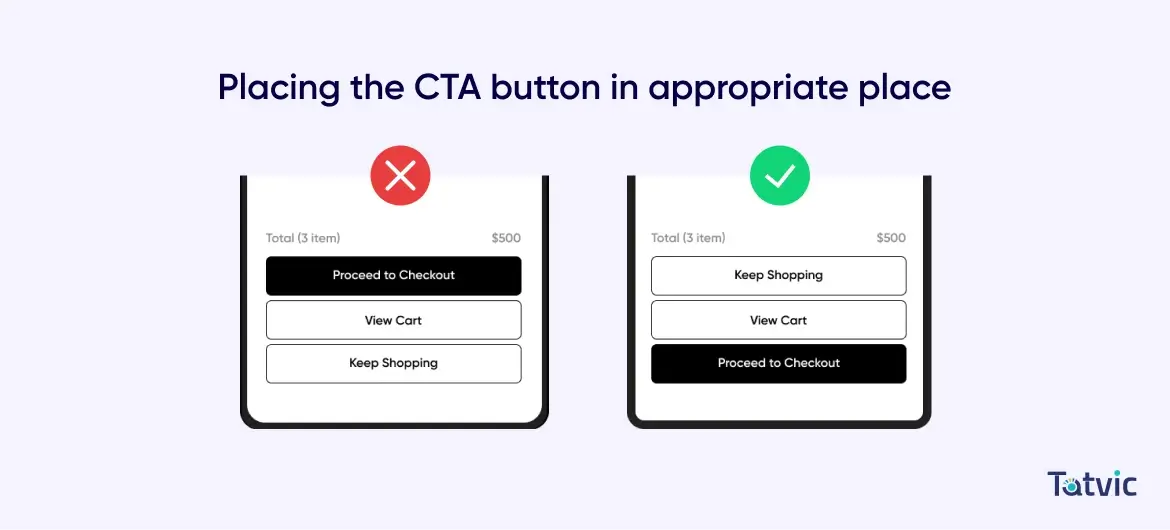
Big sizes and nice and bright colors are effective ways to grab the user’s attention but smart placement can increase the chances of CTAs being noticed even more. So a user journey is a path that the user follows to complete a certain task. You can choose efficient placement for CTA buttons to highlight but for example, if users see a CTA button before they read the information there is a high chance that users might just ignore it so make sure to give the CTA button after they read the information about the offers or services so that user has a better understanding of what they are actioning.
So instead of placing the CTA at the top, place the main CTA at the bottom, so users can get it by scanning the buttons in a single top-to-bottom flow. This makes it efficient for the user to examine each button performing any action. Also as per the thumb zone rule – the spots on the phone are easiest for thumbs to reach and, consequently, most used by people. So according to that the bottom location for CTA is also the easiest for the thumb to reach and this will further improve efficiency.
-
Add some extra information for more clarity:
We all have very short attention spans when we are browsing around the web so visitors rarely have time to read every word on the page so adding some more information about what the button does and what is the next step will help the user to understand the button functionality and add some reassurance about what the button will do.
A lack of clarity in what a button does can lead to poor conversion because if visitors don’t know what exactly clicking a button will do then it’s likely they might avoid it.
Also, It’s important to keep the CTA message short clear, and concise so that it could quickly catch the user’s attention, but when the user notices the CTA it might be useful to provide some additional information too.
For example “Try it free for 15 days” or “No credit card required” or it could be “30 days money-back guarantee” just before the “Start Trial” or any other CTA buttons. This helps to remind the visitor what they are there for.
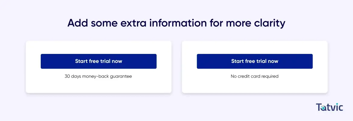
Make sure that the copy is concise yet persuasive and action-oriented. A few appropriately chosen words work much better than a long descriptive phrase. In addition, give strong and direct instructions on what users can do next.
Lastly, don’t be afraid to do a little A/B testing to see which button shape, color, etc works best for your audience. CTA buttons are one of the critical components of the pages that are worth A/B testing regularly and you might be surprised at how the conversion rates improved.
Even small changes and tweaks like changing or removing words, changing color, or increasing the font size can lead to better improvements in conversion rate. Try to test one aspect per time and this way you’ll be able to distinguish which factor makes a difference and you will never know which variations work.