Hello There!

Lorem ipsum dolor sit amet, consectetur adipiscing elit,

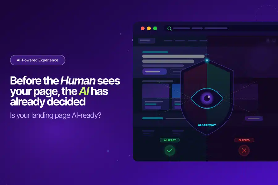
Landing Page Optimization in 2026 Has Two Audiences. Most Brands Are Only Optimizing for One.

Right now, a shopper is asking ChatGPT to find the best running shoes under $120. Another is asking Perplexity to compare skincare serums for sensitive skin. A third is asking Google’s AI Mode to build a sustainable gift set under $80.

Your brand either shows up in those answers or it doesn’t.

This is the new reality of landing page optimization. And most e-commerce teams are only solving half the problem. They’re building pages for humans who arrive. They’re not building pages for the AI systems that decide whether to send those humans in the first place.

That gap is where revenue is being lost right now.

The Funnel Has a New Front Door

For two decades, e-commerce started with Google. You optimized keywords, earned backlinks, bought ads, and drove traffic to your pages. The playbook was consistent, well-understood, and it worked.

That formula is breaking down faster than most teams realize.

McKinsey‘s AI Discovery Survey found that 50% of consumers now use AI when searching online. Among those who’ve tried it:

  • 44% say AI has become their primary way to search
  • Only 31% still prefer traditional search

This isn’t a slow, gradual shift. It’s already the majority behavior among high-intent, high-spending shoppers, exactly the audience ecommerce brands work hardest to reach. These are people with purchase intent who are actively looking for product recommendations, comparisons, and trusted sources.

Gartner‘s forecast: Traditional search engine volume will drop 25% by 2026 as AI chatbots take over queries that once ran through Google and Bing. Their analyst put it plainly: companies will need to rethink their entire marketing channel strategy as generative AI becomes embedded across every aspect of commerce.

Organic Traffic Is Already Sliding

BCG‘s research adds an uncomfortable reality check for brands still focused entirely on traditional SEO:

  • Nearly 10% of businesses are already seeing year-over-year organic traffic decline
  • Traditional organic search traffic in the US is falling at roughly 10% annually
  • Traffic to retail sites from generative AI sources grew 4,700% year over year in July 2025 alone

That last number isn’t a trend to watch. It’s a signal that landing page optimization now means something fundamentally different than it did 12 months ago. The channel driving the fastest growth in qualified e-commerce traffic is AI.

Brands still treating landing page optimization as a purely human-facing discipline are optimizing for a shrinking pool of traffic while the fastest-growing pool passes them by.

Your Landing Page Now Serves Two Audiences

Here’s what most ecommerce teams haven’t fully processed yet.

When a consumer asks an AI assistant to recommend a product, the AI doesn’t just Google it. It pulls together information from your product pages, your reviews, your structured data, third-party citations, forums, and comparison sites. It evaluates credibility, consistency, and clarity.

Then it decides whether your brand belongs in the answer.

That decision happens before any human ever lands on your page.

As McKinsey puts it: “In an agentic world, your customer may no longer be a human with a browser; it is just as likely to be an autonomous agent, acting on that customer’s behalf.”

This means landing page optimization in 2026 has two distinct jobs:

Job What It Means
Job 1 Convert the human who arrives
Job 2 Be clear, trustworthy, and recommendable to the AI that decides to send them

Most brands are doing Job 1 reasonably well. Job 2 is almost entirely ignored, which means the AI gatekeeping the recommendation never sends the human in the first place.

What the Second Job Actually Requires

Deloitte’s 2025 Digital Media Trends puts it plainly:

“We are moving away from optimising for clicks and toward optimising for understanding. When an AI system generates a response, it draws on content it can interpret and trust.”

Effective landing page optimization for AI audiences requires a specific set of structural changes most brands haven’t made yet:

  • Rich product schema and clean metadata
  • Descriptive content that language models can actually parse
  • Consistent, current information across all channels
  • FAQ content that answers real shopper questions
  • Pricing, delivery windows, and return policies in machine-readable formats
  • Third-party citations and review signals that establish credibility

Deloitte is specific about why this matters: metadata, taxonomy, and signals of expertise now play a significant role in whether a brand’s content gets surfaced accurately by AI systems. This isn’t optional polish; it’s the foundation of landing page optimization for the current environment.

Brands that skip this work don’t just miss an optimization opportunity. They become invisible to the fastest-growing discovery channel in ecommerce history.

What AI Agents Look for When Comparing Products

When AI agents compare products on a shopper’s behalf, BCG’s research shows they rely on a narrow and specific set of signals:

  1. Price - Is it clearly visible and machine-readable?
  2. Reviews - Are aggregated scores structured and prominently surfaced?
  3. Delivery speed - Is the fulfilment window stated explicitly?
  4. Return policy - Is it clear, accessible, and easy to parse?

Brands whose landing page optimization surfaces all four signals in structured, machine-readable formats have a clear structural advantage over brands presenting the same information in ways only humans can interpret.

This is not a one-time technical fix. It’s an ongoing discipline. Every product page, FAQ section, and comparison document needs to be structured for AI comprehension, not just human readability. As your inventory, pricing, and policies change, those updates need to flow consistently across every channel where AI systems might pull your information.

Why This Matters for Your Revenue

The commercial case for better landing page optimization is now impossible to ignore.

Adobe Analytics studied over a trillion visits to US retail sites during the 2025 holiday season. Shoppers arriving from generative AI assistants significantly outperformed every other traffic source:

Metric AI-Referred Shoppers
Conversion rate +31% vs all other traffic
Thanksgiving conversion +54%
Black Friday conversion +38%
Bounce rate 33% lower
Time on site 45% more
Pages viewed per visit +13%

Revenue per visit from AI-referred shoppers increased 254% year over year during the 2025 holiday season. That’s not a rounding error. That’s a different category of visitor entirely, one that only arrives if your landing page optimization has done the work of earning the AI recommendation upstream.

The Highest-Intent Traffic on the Internet

Salesforce data reinforces the same story from a different angle.

In the first six months of 2025, conversion rates from AI channels were 700% higher than traffic referred from social media. That puts AI-referred traffic in its own category, more intent-loaded than paid search, more purchase-ready than any other digital acquisition channel currently available.

These visitors didn’t stumble onto your site. They arrived because an AI system evaluated your brand, found it credible and relevant, and recommended it by name. They came pre-qualified.

Proper landing page optimization is what earns that recommendation in the first place. Without it, the pre-qualification never happens, and the high-intent visitor never arrives.

The Stakes Are $5 Trillion

McKinsey’s agentic commerce report, published in October 2025, laid out what’s commercially at stake globally:

  • AI agents could mediate $3-5 trillion in global consumer commerce by 2030
  • US B2C retail alone could see up to $1 trillion in AI-orchestrated revenue

Their framing was deliberate: “This is not just an evolution of e-commerce. It’s a rethinking of shopping itself.” They compare this transition to the web and mobile revolutions and project that it will move faster than either one did.

How Much Time Do You Actually Have?

Deloitte’s Agentic Commerce research puts a concrete deadline on the urgency:

  • 63% of global retailers believe companies without an AI strategy will fall behind within two years
  • By 2030, 55% of digital consumers will start product research on LLM platforms
  • 25% of global e-commerce sales will be enabled by AI agents by 2030

Brands investing in landing page optimization for AI audiences now are locking in positions in the recommendation layer that will be hard for slower competitors to displace.

BCG’s research makes the compounding effect explicit: once a brand becomes an established, authoritative source that AI systems trust and cite, it tends to get cited more often, creating a visibility advantage that grows over time. Brands waiting for this to be “fully proven” before acting will find those positions already taken.

One Page. Two Audiences. One Strategy.

Here’s the good news: optimizing for AI agents and optimizing for human visitors are not competing priorities. They reinforce each other.

The same qualities that make a page convert real people are the qualities that earn AI recommendations:

  • Clear, well-structured product information
  • Honest reviews surfaced prominently
  • Transparent delivery and return policies
  • FAQ content that answers real questions shoppers actually ask

Effective landing page optimization in 2026 doesn’t mean choosing between SEO and AIO. It means treating both as one coherent strategy: get found before the visit, convert after it.

Your Quick Action Checklist

Before your next product launch, run your landing page against these questions:

[ ] Is pricing visible in a machine-readable format?

[ ] Does the page include FAQ schema for common shopper questions?

[ ] Is the delivery window and return policy explicitly stated?

[ ] Is product metadata consistent across all channels?

[ ] Are credible third-party sources citing or reviewing this page?

If you answered no to two or more, your landing page optimization is only serving one of your two audiences and leaving the highest-converting traffic source on the table.

Ready to Close the Gap?

The brands winning in 2026 aren’t choosing between old and new. They’re doing both with infrastructure built for both audiences from the ground up.

Tatvic works with e-commerce brands to close the gap between traffic and revenue through agentic AI-powered landing page optimization and customer experience strategy.

Curious what your current pages are leaving on the table? Let’s find out.

10 Proven Steps to Build a High Converting Landing Page That Converts Like Crazy

10 Proven Steps to Build a High Converting Landing Page-Tatvic

Creating a High Converting Landing Page is more than just good design, it’s about connecting with your audience in a way that compels them to act.

Whether your goal is to drive sales, collect leads, or increase sign-ups, your landing page needs to deliver the right message, at the right time, to the right people.

This guide breaks down proven steps to help marketers, business owners and growth teams craft landing pages that don’t just attract attention but turn that attention into action.

Let’s dive into it->>

What is a High Converting Landing Page?

A high-converting landing page is a focused webpage designed to guide visitors toward a single, specific goal whether that’s making a purchase, signing up for an event, or submitting their contact information.

What sets it apart is how effectively it leverages user intent, clean design, compelling messaging, and trust-building elements to boost conversions. It minimizes distractions and highlights the core value proposition clearly.

Optimized for mobile and speed, a high-converting landing page often uses persuasive CTAs and social proof to drive meaningful user action.

Case Snippet:
ConvertKit, an email marketing tool, revamped their landing page to speak directly to user challenges. This clear shift toward benefits over features led to a 44% increase in trial sign-ups in under a month.

What’s the Average Conversion Rate for Landing Pages?

Conversion rates vary depending on industry and audience, but research shows the average is about 2.35%.

The top 25% of landing pages convert at 5.31% or more, while the top 10% reach 11.45%+.

To stand out, aim for a 5%+ conversion rate, especially if your offer and traffic are highly relevant.

Case Snippet:
Tatvic improved an eCommerce brand’s landing page structure and CTA positioning, boosting conversions from 3.2% to 8.6% in just 2 months.

Why a High Converting Landing Page Matters

Your landing page is often a potential customer’s first impression of your brand.

Unlike a homepage that has multiple goals, a landing page has one: conversion.

It’s your chance to maximize ad spend, lower acquisition costs, and increase the quality of leads.

Case Snippet:
Shopify cut their page load time by one second and saw a 30% increase in free trial sign-ups. Faster pages equal happier visitors and more conversions.

10 Proven Steps: How to Create a High Converting Landing Page

Creating a landing page that truly converts requires more than just good design, it demands:

  • strategy,
  • clarity and
  • user-focused execution.

Every element on your landing page should serve a purpose, whether it’s guiding attention, building trust, or driving action.

From headline to CTA, each component must align with your audience’s needs and intent.

By combining data-backed insights with persuasive content, you can significantly boost your conversion rates.

Remember, high-converting pages aren’t built on guesswork they’re built on strategy and testing.

Follow the best practices to turn your traffic into qualified leads and loyal customers.

Let’s See 10 Proven Steps to Build a High Converting Landing Page

1. Know Your Audience Inside Out

Before you touch layout or wording, get clear on who your audience is.

Your landing page should reflect their specific needs, pain points, and aspirations.

Action Steps:
  • Build detailed buyer personas.
  • Conduct interviews or surveys.
  • Analyze user data and behaviors.

Case Snippet:
Tatvic helped an edtech company discover that their top-converting users were mobile-first. After a mobile-centric redesign, conversion rates jumped from 2.3% to 7.1%.

2. Set Clear & Measurable Goals

Every great landing page is built with one goal in mind. Multiple CTAs or objectives create confusion and drop-offs.

Common Goals:
  • Collect leads
  • Drive product sales
  • Secure event sign-ups
  • Encourage free trials
Action Steps:
  • Define your main KPI (e.g., form submissions, purchases).
  • Ensure every element supports this single objective.

Industry Insight:
HubSpot boosted ebook downloads by 50% simply by reducing form fields from five to three.

3. Write a Benefit-Driven Headline

Your headline is the hook. Make it clear, compelling and focused on the outcome for the visitor not just the features.

Checklist:
  • Keep it short and powerful
  • Focus on benefits
  • Add emotional appeal

Example: “Triple Your Email List with Our Free Growth Tool”

Industry Insight:
Basecamp
swapped “Organize Your Projects” for “Finish Projects Faster” resulting in a 102.5% lift in conversions.

4. Craft Relevant, Engaging Content

Great landing page content speaks directly to your visitor’s intent. Keep your language clear, your format skimmable and your tone human.

Tips:
  • Highlight pain points and solutions
  • Use bullet points for benefits
  • Skip jargon, use natural language
  • Tell stories that create a connection

Industry Insight:
Crazy Egg introduced storytelling to explain how their tool helps users. Result: a 64% bump in conversions.

5. Make Your CTA Stand Out

Your call-to-action (CTA) is where the magic happens. It should be bold, benefit-focused, and placed where it’s easy to find.

Tips:
  • Use active language: “Try Free,” “Get Started,” “Claim My Spot”
  • Place it above the fold and in key scroll spots
  • Use contrast to make it pop visually

Industry Insight:
Dropbox simplified their landing page to just one CTA: “Sign up for free.” The result? A notable spike in new users.

6. Add Visuals That Support Your Message

Visuals help users absorb information quickly and make your page more engaging.

What to Include:
  • Real photos, not stock
  • Product demos or walkthroughs
  • Short explainer videos

Industry Insight:
Pages with video convert up to 80% better. Wistia saw an 85% jump after adding an explainer video.

7. Build Trust With Proof

People trust people. Show proof that others have benefited from your offer.

Options to Use:
  • Testimonials and reviews
  • Client logos
  • Case studies and stats

Industry Insight:
Airbnb‘s user-generated reviews not only built trust but also helped boost their search engine rankings.

8. Optimize for Speed and Mobile

A slow or poorly optimized page kills conversions. Make sure your page loads fast and looks great on any screen.

Best Practices:
  • Compress images
  • Use a content delivery network (CDN)
  • Keep code light and fast

Industry Insight:
Pinterest improved mobile page speed and saw a 15% lift in sign-ups.

9. Keep the Design Simple and Focused

Your design should guide visitors toward your goal-not distract them.

Design Tips:
  • Use whitespace effectively
  • Minimize navigation
  • Focus on one CTA

Industry Insight:
Campaign Monitor removed navigation links and boosted sign-ups by 17%.

10. Test and Improve Continuously

Optimization is a never-ending process. Use A/B testing to improve your headline, CTA, form layout, and more.

What to Test:
  • CTA copy and placement
  • Page layout and visuals
  • Incentives or offers
Tools to Try:
  • Google Optimize
  • Crazy Egg
  • Hotjar

Industry Insight:
Moz saw a 13% increase in sign-ups just by changing their CTA text from “Get Started” to “Start My Free 30-Day Trial.”

Common Pitfalls to Avoid for Designing A High Converting Landing Page

Even small missteps can derail your landing page’s performance.

To build a high converting landing page, it’s crucial to eliminate elements that create friction or confuse your visitors.

Common mistakes, like unclear messaging or poor mobile optimization can significantly lower your conversion rate.

Avoid the below mentioned pitfalls to ensure every visitor has a smooth, goal-driven experience:

  • Conflicting or multiple CTAs
  • Low-quality or generic visuals
  • Overly complex copy
  • Poor mobile experience

Recommended Tools

Use these tools to build high-performing landing pages without heavy development work:

  • Unbounce: Drag-and-drop simplicity
  • Instapage: Enterprise-level testing and personalization
  • Leadpages : Great for small budgets
  • HubSpot: CRM-integrated landing pages for smarter tracking

Tip: Choose the tool that fits your goals and team skill level.

Conclusion: Every Click Deserves a Result

A high-converting landing page blends strategy, empathy, and data.

It speaks to your audience’s needs, presents a clear offer, and nudges them gently but effectively toward action.

By following these steps, you’ll be on your way to building landing pages that don’t just look impressive but also they perform.

Need help turning your landing pages into conversion machines?

Tatvic’s CRO experts can help you design, test, and optimize pages that deliver measurable results.

Ready to grow?

Let Tatvic help you make every click count.

Testing Landing Pages, The best way to increase Conversion rate

cnet
Are you testing your landing pages? It’s the best way to increase conversion rate and understand user behavior. This post takes on basics of A/B testing. After reading, you can contact us for a Free A/B Test campaign.

Is your Landing page really doing good? can it be better?

You must have heard someone saying, “wow, that’s an awesome Landing Page.” How awesome? Are you sure that the conversion rate you are getting on your current Landing page is the best? Are you carrying any A/B testing on  it? No? Then I doubt how do you say that.

On Internet, the same user changes his behavior from one web site to other. I might look for girls on Facebook with the purpose of dating, but i won’t do that on Linked in. I’ll become a serious guy in the latter, even if the same girl is there on both the sites. You can either change your site according to the user behavior or change the user behavior as per your site. The latter is very challenging but gives rewards.

e.g. On facebook, every 15 days you see a change, may be profile updates are changed in to news feeds. you don’t question it and change the way you surf facebook and remember it next time. ofcourse the changes are made keeping user in mind, but they tend you to change your behavior.

e.g. while on gmail, they knew that people have a lot of junk mails which don’t go to Spam folder, so they introduced Priority Inbox.

In both the cases, users are happy. It depends on which way you want to chose.

Any way you chose, but to see whether users are behaving the way you want them to, you’ve got to test your pages. Test your pages with variations.

How it  works?

in A/B tests, 2 versions of the same page are tested among 2 groups of users at the same time. All your users are split in two on random basis and are served the page they are selected to see. When they perform an action and land on a conversion page, it forms a conversion. It’s necessary to have only one conversion page for all version you are testing. A conversion page is normally a Thank you page for authenticating the action just performed. A conversion here can be just a click, or download, or a form fill.

How many pages can I execute A/B test at once?

Test 2 pages or 10, up to you. The thumb rule is  “the lesser pages you test, the quicker results you get”. Sites with huge traffic might see results in a few days.


These are the variations you should test:


Call to actions


Free download

Call to action can be a Text or a Button. Anything that tells a user to do something is a call to action. These are the things you should test in call to actions:

- Text - Test text variations.

e.g., “Buy now” vs “Add to cart”, “Free Download” vs “Get it free”, “Fill up this form” vs “Register here”

- Buttons colors

Some colors attract users more. But it depends on the background to foreground combination. Also depends on the Target Audience. Red button on a Travel site might not do well. But it might do great on a Music site.

e.g, red vs yellow

- Buttons and text - See if Buttons or Text is performing better.

A/B Testing for Sign up Forms

A/B Testing - Twitter

Form is the second most important thing on a Landing Page. It gets you more Form fills just a small change.
- Position - Change the position. Test Left vs Right, Horizontal vs vertical.

- Split - If you have a long form, Try splitting a log form in to 2-3 steps and justify each step. Then test Normal vs Split.

- Size - Drop some fields you think are not so important and can keep users from filling in. Try removing any “not so important fields”. Test Long vs Short.

A/B Testing for Header text

A/B Testing Sharekhan

Header does a very good job grabbing users attention. Always keep the header simple, descriptive and as short as possible.

Test different text in the header. e.g. “Great deals on Movie tickets” vs “Cheapest movie tickets in town”, “Great articles on Google analytics” vs “Google analytics at its best”

A/B Tests for Images / Banners

A/B Tests - Jet

Images are very easy to engage users. Sometimes, it helps convert more with a minor change in communication or call to action.

- Image size - it might happen that a smaller image with some breathing space might increase clicks by a good number. Sometimes, a bigger image can bring more users. Test sizes.

e.g., Small vs Big, Horizontal vs Vertical,

- Communication / Call to action - The call to action can be tested same as described above. The communication can be tested for variations of influential lines.

e.g., “Tack visits easily” vs “The best way to track visits”, “Great shirts at great prices” vs “Best deals on shirts in town”

It’s not necessary to test all the features of an object. Test one at a time. For testing features of call to action, test Text first, then test Button colors, and then Buttons and Text.

What types of Pages can be tested?

Any page where some action from the user is required. Here are examples:

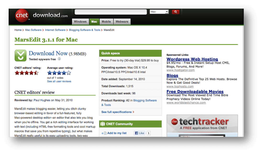
Download page

cnet

A download page for software, articles, books, videos or photos.

What content to executing A/B test on :

Call to actions

Position of the button

Images if any. if there’s no image, try putting one.

A/B test on Lead generation page

mailchimp


Sign up page with a form for a website or free trial for a product. Or A lead generation page for a product trial or a bank account.

What to test:

Button

Header of the form, Position and size

Images


Product page

ipod

Page for a particular product display. Or a multiple product page. e.g., A T-shirt or an MP3 player.

What to test:

Button

Call to action

Images

Likewise, there can be many other pages and Variation you can test. But most important, Please test.

A/B Testing Tools

The most widely used tool is Google web optimizer. It’s free. There are other Free and Paid tools available, but when Google does the best job, why go anywhere else. However, for paid tools you can learn our review on new A/b Test tools.

We at tatvic are specialized in Conversion rate optimization projects and A/B test is our love. And to spread the love, we are offering 3 FREE A/B tests a month. You can be the lucky one to grab one. Doesn’t matter even if you test your pages, there’s no harm in trying for free. If you have never test your pages, then you have no right to wait,

Register for a FREE A/B test now!


Happy Testing!

Bot Icon
Bot Icon

Tatvic Bot

Explore About Tatvic and Services